Web Conversion Optimization That Turns Traffic Into Revenue
Master web conversion optimization with frameworks, tactics and measurement to turn more visitors into customers across every channel.
Published on 13 min read

Table of contents
- Introduction Why More Traffic Alone Will Not Grow Revenue
- What Web Conversion Optimization Really Means
- CRO is a journey, not a button
- Small gains matter because traffic repeats
- Key Levers That Move Conversion Across Every Channel
- Message match comes first
- Speed creates a threshold
- Layout, forms, and device experience work together
- The Trust Gap Why Proof Now Beats Friction Fixes
- Audit proof at the decision point
- Proof has to be believable
- Where AI Copy Helps and Where It Hurts With Real Examples
- Match the tool to visitor intent
- Use AI as a controlled testing layer
- How to Measure Test and Scale Your Optimization Program
- Choose a relevant benchmark
- Turn evidence into a testable hypothesis
- Run a repeatable operating cycle
- Your Next Steps to Turn Visitors Into Customers
- A focused 30-day starting plan
Your traffic dashboard is moving in the right direction. Paid campaigns are active, search visibility is improving, and more people are arriving on your landing page. Revenue, however, hasn't moved with them. Visitors click, browse, hesitate, and disappear.
That situation usually isn't a traffic problem. It's a conversion problem. Web conversion optimization helps you understand where visitor intent breaks down, then improves the experience so more of the audience you've already earned takes a valuable next step.
The work goes beyond changing a headline or button color. It combines message clarity, page speed, mobile usability, form design, and credible proof. In 2026, it also requires a careful view of AI-generated copy, because fast variation only helps when the language fits the page and feels believable.
Introduction Why More Traffic Alone Will Not Grow Revenue
A growth team can spend weeks improving acquisition while the website wastes the result. A new campaign may bring qualified visitors to a product page, but a vague promise leaves them unsure what the product does. A strong offer may still fail when the page loads slowly on a phone. A polished testimonial may create little confidence if nobody can verify who gave it.
The uncomfortable part is that traffic reports can make this failure look like progress. Sessions rise, impressions grow, and campaign dashboards look healthy. Yet the business still has the same pipeline or sales problem because the page isn't turning enough intent into action.
CRO changes the question. Instead of asking only how to attract more visitors, you ask:
- Where does intent weaken? Find the step where people stop progressing.
- What creates hesitation? Look for missing information, unclear value, technical friction, or weak proof.
- Which change deserves attention first? Prioritize changes that affect many relevant visitors and connect directly to a business outcome.
A visitor doesn't arrive as a conversion. They arrive with a question, a concern, or a task. They may need to understand your offer, compare alternatives, check whether your company is credible, and decide whether the next step feels safe. Your page has to support that sequence quickly.
Your value proposition is the starting point. A useful guide to customer value proposition fundamentals can help your team clarify the promise before it experiments with wording.
This article builds a practical system from that foundation. You'll learn what counts as a conversion, which levers matter across devices, why proof has become more important than small friction fixes, where AI copy performs unevenly, and how to create a repeatable testing program.
The goal isn't to chase a universal “perfect” rate. It's to make each visit more valuable by matching the visitor's intent with a fast, clear, and credible experience.
What Web Conversion Optimization Really Means
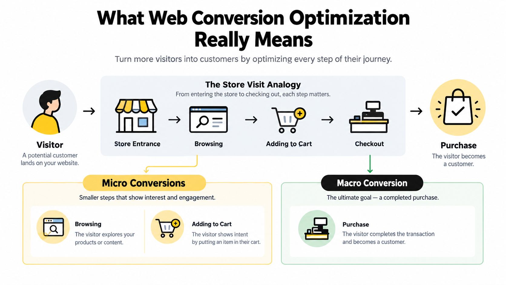
Think about entering a physical store. You notice the entrance, scan the shelves, pick up a product, ask a question, and eventually decide whether to buy. A website follows the same basic journey, even though the signals look different.
A micro conversion is a smaller action that indicates progress. On a website, that might mean viewing a pricing page, watching a product demonstration, adding an item to a cart, or starting a form. A macro conversion is the primary business outcome, such as a completed purchase, paid signup, qualified demo request, or submitted quote form.
Micro conversions matter because they show where visitors are moving and where they stall. If many people view pricing but few begin a demo request, the problem may sit in the offer, proof, pricing explanation, or form experience. If people never reach pricing, the page may have a message or navigation problem earlier in the journey.
CRO is a journey, not a button
A redesign changes the appearance or structure of a site. A/B testing compares experiences. CRO connects research, prioritization, implementation, and measurement so each change addresses a reason visitors aren't progressing.
For each important page, ask four questions:
- What brought this visitor here? The page should reflect the promise made by the ad, search result, email, or referring page.
- What does the visitor need to understand? Explain the offer in language that matches their awareness and intent.
- What could make them doubt the decision? Address risk, uncertainty, fit, price, delivery, privacy, or credibility.
- What should happen next? Give one clear action and make it easy to complete.
The checkout is part of this journey, not an isolated technical endpoint. Payment options, error handling, confirmation, and routing can all shape the final experience, so resources on payment routing and checkout UX can be useful when ecommerce teams investigate late-stage abandonment.
Small gains matter because traffic repeats
A page with more relevant traffic creates more opportunities for every improvement. But don't treat the headline rate as a verdict without context. The widely used benchmark from Sixth City Marketing places average landing-page conversion at 2.35% across industries, with 4.14% on desktop and 1.53% on mobile. The same benchmark reports that top-performing pages can reach 11% or more, illustrating the size of the gap between an average experience and an exceptional one. Sixth City Marketing's CRO benchmark summary provides the source for these figures.
The practical lesson is simple. CRO isn't about making a button more visually exciting in isolation. It's about helping a visitor move from arrival to confidence to action.
Key Levers That Move Conversion Across Every Channel
Most pages have plenty of elements, but only a few control whether visitors understand, trust, and complete the next step. Start with the elements closest to the visitor's decision rather than polishing decorative details.
Message match comes first
A visitor who clicks an ad for a specific solution expects to see that solution immediately. If the landing page replaces the campaign promise with broad brand language, the visitor has to reconstruct the connection. Many won't.
Align the page's headline, subheading, visual context, and CTA with the source message. A search visitor looking for an accounting platform shouldn't land on a generic “Transform your business” page. They should see a clear explanation of the accounting problem, the relevant solution, and the next action.
Speed creates a threshold
Page speed isn't just a technical quality score. It affects whether the visitor reaches the content before abandoning the journey. Google's commissioned research found that a 0.1-second improvement in mobile site speed can raise conversions, with average gains of 8% for retail sites and 10% for travel sites. These findings are documented in Google's Milliseconds Make Millions report.
That result suggests a useful operating rule. Fix the first obvious delays, especially on mobile, before spending time on minor copy variations. Compress heavy images, reduce unnecessary scripts, and check the loading experience on an actual phone, not just a desktop browser.
Layout, forms, and device experience work together
A strong page hierarchy lets a visitor scan the offer without reading every word. Put the core promise near the entry point, support it with relevant evidence, then place the CTA where the decision naturally occurs.
Forms deserve equal attention. Remove fields that don't support the immediate decision, explain why sensitive information is needed, and make errors easy to understand. For ecommerce, review the complete path from product selection through payment, not only the product page.
Desktop and mobile should share the same promise, but they shouldn't receive identical treatment. Smaller screens magnify cramped layouts, hidden information, difficult controls, and slow assets. Review the mobile funnel separately because aggregate performance can conceal device-specific problems.
Practical rule: Fix the point that blocks the most qualified visitors, not the element your team finds easiest to redesign.
You can also use real-time personalization for conversion optimization when different audiences need different messages, but personalization should follow clear segmentation. It shouldn't become another layer of irrelevant variation.
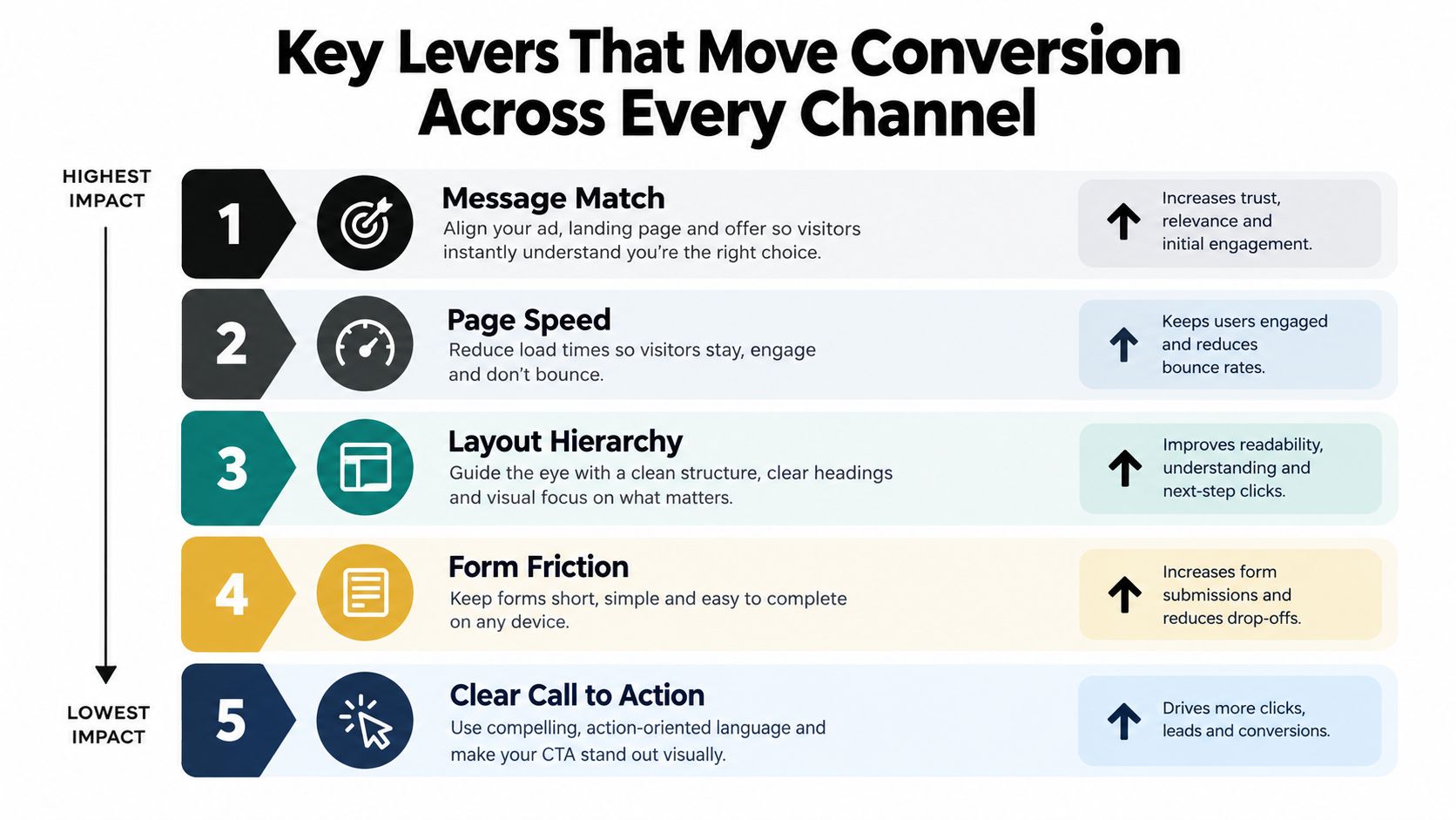
A short visual explanation of these levers can help teams align before prioritizing tests.
The Trust Gap Why Proof Now Beats Friction Fixes
Marketers often respond to abandonment by removing steps. Fewer fields, fewer clicks, and shorter pages can help, but they don't solve a visitor who isn't convinced the company can deliver what it promises.
Independent 2026 coverage describes a shift from usability friction toward visitor doubt as a central abandonment problem. That matters because a friction fix makes action easier, while proof makes action feel safer. If doubt remains, the visitor may appreciate the cleaner interface and still leave.
Audit proof at the decision point
Trust signals work best when they answer the objection a visitor has at that moment. A security badge near payment addresses one concern. A named customer story near a demo form addresses another. A visible explanation of who supports the product can reduce uncertainty for a high-consideration purchase.
The trust signals identified as improving conversion in tests included:
- Named testimonials: Include the customer's name, title, and company instead of relying on anonymous praise.
- Independent reviews: Link reviews to the external platform so visitors can inspect the source.
- Verifiable security claims: Make security or compliance badges clickable and connect them to certificates.
- Visible team photos: Show the people behind the company when a personal relationship or service commitment matters.
- Specific customer evidence: Replace broad claims with concrete descriptions of the problem solved and the outcome delivered.
The source also connects this trust gap with the spread of low-trust, AI-generated web content. SiteGrade's 2026 CRO coverage provides the context for this shift and the cited trust signals.
Proof has to be believable
A logo wall may establish familiarity, but it doesn't automatically prove that your product fits the visitor's situation. A testimonial saying “great service” creates less confidence than a named account explaining what changed and why the service mattered.
Place evidence beside the claim it supports. If your headline promises implementation help, show who provides it. If your product handles sensitive information, make the relevant security details easy to verify. If your offer requires a sales conversation, show the people and process behind that conversation.
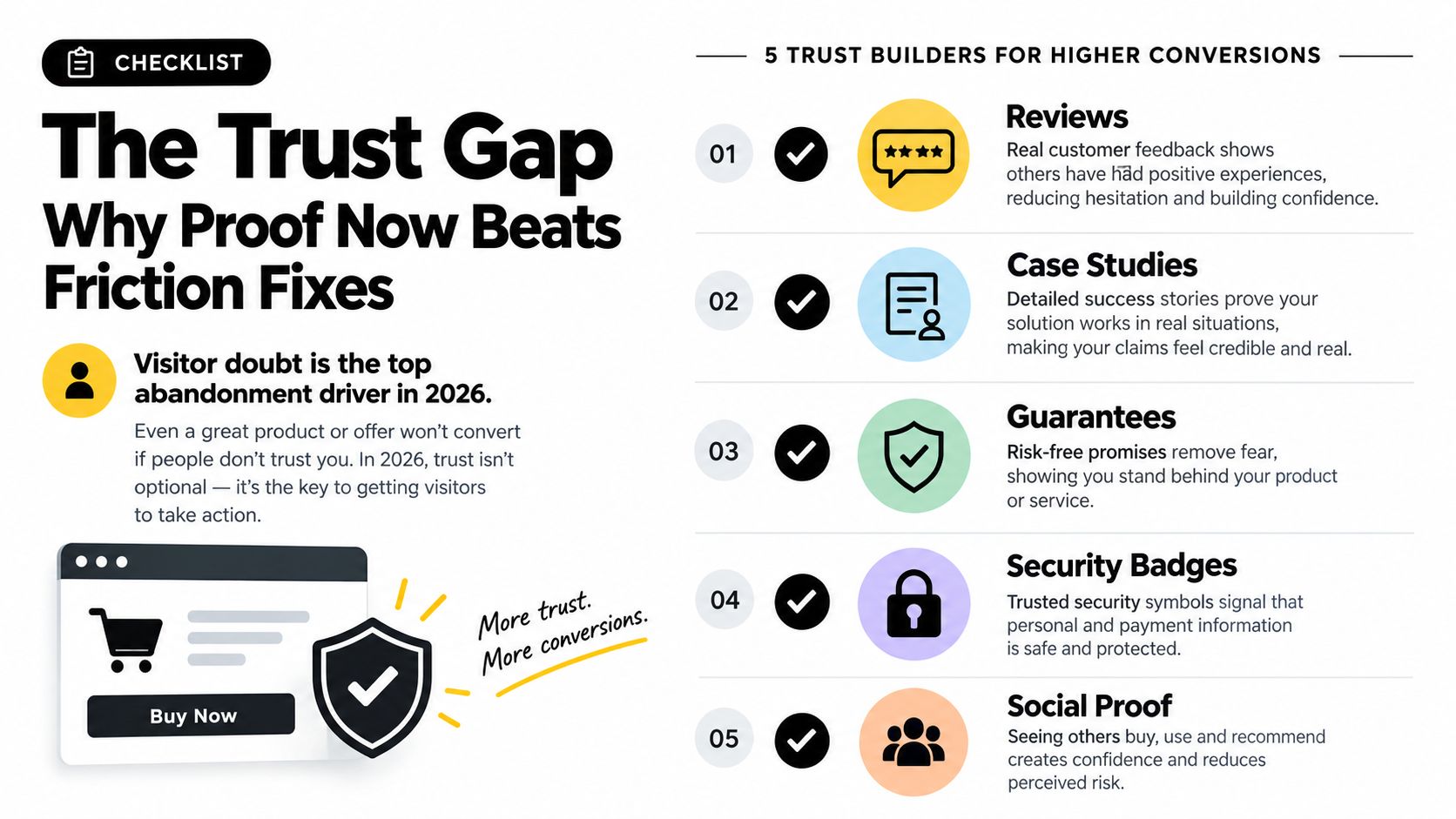
Visitors don't need more persuasion when they need evidence.
Before changing a CTA, inspect the page as a skeptical buyer. Can the visitor tell who stands behind the offer, whether the claims are independently supported, and what happens after they click? Those answers may create more movement than another round of clever copy.
Where AI Copy Helps and Where It Hurts With Real Examples
AI makes variation cheap. That changes the testing constraint, but it doesn't remove the need for judgment. Generated copy can produce useful alternatives quickly, yet the same fluent language can sound generic, overconfident, or poorly matched to the emotional stakes of the page.
A 2026 study of 2,000 landing pages found that AI copy performed unevenly by page type. It was roughly equal to human copy on B2B functional pages, slightly positive on B2B SaaS and lead-generation forms, flat on B2B services, and worse on DTC ecommerce and webinar pages. The findings are reported in Digital Applied's landing-page conversion study.
| Page Type | AI vs Human Performance | Recommended Approach |
|---|---|---|
| B2B functional pages | Roughly equal | Use AI for structured variants, then review accuracy and audience fit |
| B2B SaaS pages | Slightly positive | Test benefit-led and task-focused alternatives |
| Lead-generation forms | Slightly positive | Use AI to explore concise value and reassurance language |
| B2B services | Flat | Keep human strategy in control and test only targeted variations |
| DTC ecommerce | Worse | Preserve human-crafted product context, emotion, and credibility |
| Webinar pages | Worse | Keep the narrative, authority, and event-specific angle human-led |
Match the tool to visitor intent
Functional pages often answer a practical question. The visitor wants to understand a capability, complete a task, or request information. AI can help generate alternatives such as:
- Headline: “Automate recurring invoice follow-up”
- Subheading: “Connect your billing workflow and give finance teams one place to track outstanding actions.”
- CTA: “See the workflow”
These variants are specific, restrained, and easy to compare. They don't ask the model to invent proof or imitate a customer's voice.
A DTC product page needs a different standard. Product meaning can depend on sensory detail, identity, taste, or personal context. A generic variant like “Upgrade your everyday routine” may sound polished but fail to explain why the product deserves attention. Human writers should protect the product's distinctive story, customer language, and evidence.
Use AI as a controlled testing layer
AI should generate options inside clear boundaries. Give it the approved value proposition, audience, prohibited claims, tone, and page goal. Require a human review for factual accuracy, compliance, brand voice, and trust signals.
A useful experiment compares one meaningful change at a time, such as a functional headline or CTA, while keeping the offer and proof stable. The result should teach you something about visitor intent, not merely produce a new sentence.
The best AI variant isn't the most original one. It's the one that makes the page's true value easier to understand and believe.
How to Measure Test and Scale Your Optimization Program
A conversion rate only becomes useful after you define the audience, action, and context behind it. Comparing a broad industry average with a narrow, high-intent campaign can lead your team to “fix” a page that's already working for its market.
Choose a relevant benchmark
A benchmark across 41,000 or more landing pages places the median landing-page conversion rate at 6.6%, while top-performing pages serving warm or highly targeted traffic can reach 10% to 20%. ConversionTeam's benchmark analysis supports these figures and emphasizes the effect of industry and traffic quality.
Use that context to create segments rather than one blended number. Separate device, acquisition source, audience temperature, page type, and new versus returning visitors where your tracking supports it. A segment-specific baseline tells you more than a headline rate that mixes unrelated journeys.
Turn evidence into a testable hypothesis
Start with the funnel. Identify a meaningful drop-off, then combine quantitative behavior with qualitative evidence from recordings, surveys, support conversations, or sales feedback. Write the hypothesis in a form your team can test:
If we make the implementation process visible beside the demo form, qualified visitors will feel less uncertainty and begin more demo requests.
The statement identifies the change, the audience, the reason, and the outcome. It also prevents a common failure mode, testing a random idea because it sounds promising.
Run a repeatable operating cycle
A lightweight program can use this weekly rhythm:
- Review: Check conversion, revenue-linked outcomes, device performance, and funnel progression.
- Diagnose: Examine the pages and segments with the clearest opportunity.
- Prioritize: Rank ideas by likely impact, evidence strength, effort, and risk.
- Test: Choose a controlled comparison that isolates the main change.
- Record: Document the result, confidence, segment differences, and next decision.
- Scale: Apply a validated learning to a related page or channel only when the context matches.
Tools that use alternative traffic allocation approaches can support ongoing experimentation. Learn how a multi-armed bandit testing approach differs from a fixed split before selecting the method for your program.
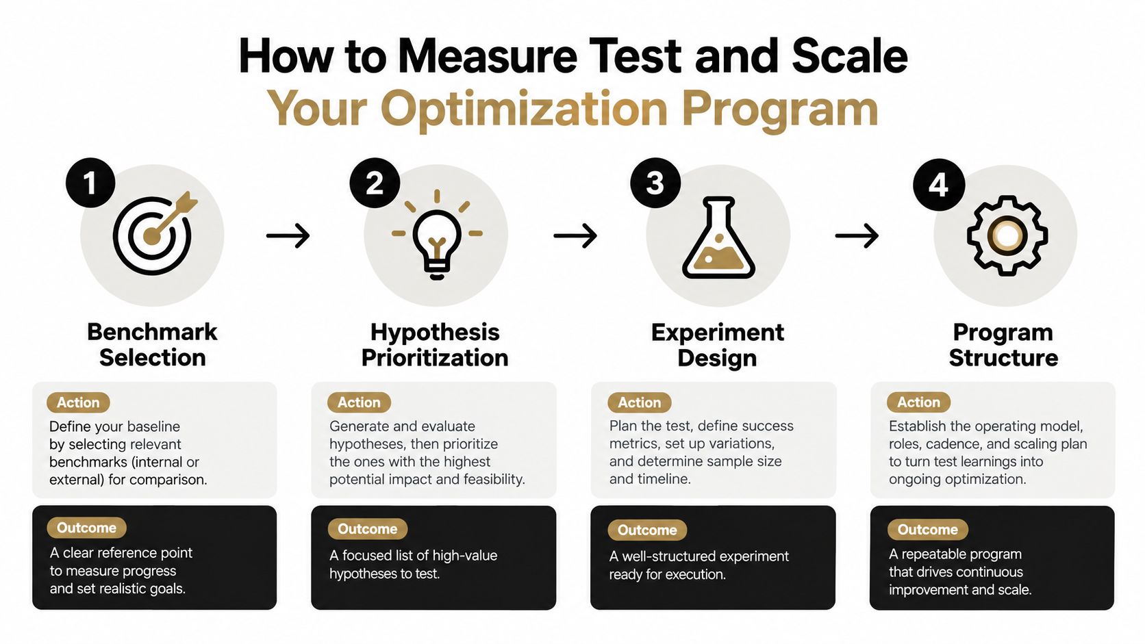
Don't judge a winner from conversion rate alone. Check lead quality, completed purchases, revenue contribution, and downstream behavior. A page can increase a shallow action while weakening the business outcome you care about.
Your Next Steps to Turn Visitors Into Customers
The fastest way to make CRO practical is to choose one important journey and inspect it as a visitor would. Don't begin with a site-wide redesign or a long backlog of button ideas. Begin with the page, audience, and action that matter most to the current growth plan.
A focused 30-day starting plan
Days one through seven, establish the baseline. Confirm the macro conversion, map the supporting micro conversions, and segment performance by device and traffic source. Review the mobile experience manually, including loading, scrolling, form entry, and checkout or submission.
Days eight through fourteen, diagnose the hesitation. Watch visitor behavior, read questions from sales and support, and compare the page promise with the campaign or search intent that brings people in. List missing proof separately from usability problems, because each requires a different remedy.
Days fifteen through twenty-one, improve the foundation. Fix the clearest speed issue, remove unnecessary form friction, clarify the primary action, and add proof that a visitor can verify. Keep the changes connected to a specific hypothesis.
Days twenty-two through thirty, run one controlled copy test. Choose a page type where AI-generated variants fit the visitor's intent, or write the alternatives yourself when the page depends on emotion, narrative, or distinctive product context. Track the primary conversion and the quality of the resulting action.
At the end of the month, keep the learning, not just the winner. Record what the audience responded to, which objections remained, and where the next bottleneck sits. That record becomes the foundation for a program instead of another isolated optimization sprint.
Polish reads your landing page, generates alternative headlines, subheadings, and CTAs, serves variants to real visitors, measures conversions, and keeps the winning version live. Visit Polish to explore an AI-assisted way to test page copy while keeping your web conversion optimization program focused on measurable outcomes.
- web conversion optimization
- conversion rate optimization
- CRO strategy
- landing page optimization
- growth marketing
Your website rewrites itself until it converts.
Polish writes new versions of your headlines and CTAs, tests them on your real visitors and keeps the ones that win.
Start free