Social Proof in Marketing: Types, Tests and Examples
Learn how social proof in marketing works, which types convert best, and how to place and test them on landing pages and ads with clear experiments.
Published on 12 min read

Table of contents
- Social Proof Types and Where Each Works
- Why Social Proof Changes What Visitors Decide
- Where to Place Proof on Pages and Ads
- How Much Proof Looks Credible
- Why perfect-looking proof can create doubt
- Signals that help visitors judge authenticity
- Examples From Landing Pages and Ads
- Testing Proof Variants With Conversion Data
- Keep quality beside the conversion result
- Confirm Your First Proof Test This Week
A visitor reaches your checkout, pauses over the button, and wonders whether the product is worth the money. Your page can repeat its own claims, or it can show evidence from people who've already made the choice. Social proof in marketing is the use of other people's actions and opinions to help visitors feel more confident about a decision.
The challenge isn't just adding praise. Proof has to answer the visitor's real question, appear at a useful moment, and look believable. Too little can leave doubts unanswered; proof that seems manufactured can create new ones.
Social Proof Types and Where Each Works
A visitor hovering over a checkout button may be asking, “Will this work for me?” Social proof gives them clues from other people's choices and experiences. A testimonial can make a result feel attainable, while a review count can suggest that many customers have tried the product. Each format has a different job, and each can fall flat if it feels irrelevant or hard to verify.
| Proof type | Strongest use | Main risk |
|---|---|---|
| Customer testimonials | Reducing doubt about outcomes | Looks staged when generic |
| Star ratings and review counts | Comparing options quickly | Few reviews can look suspicious |
| Case studies | High-consideration purchases | Takes time to read |
| Customer logos | Signaling company credibility | Logos alone prove little |
| Live activity counts | Creating momentum | Fake counters damage trust |
| Expert endorsements | Authority in regulated fields | Endorser must be relevant to the buyer |
| Social posts and user-generated content | Showing real use in context | Hard to verify without context |
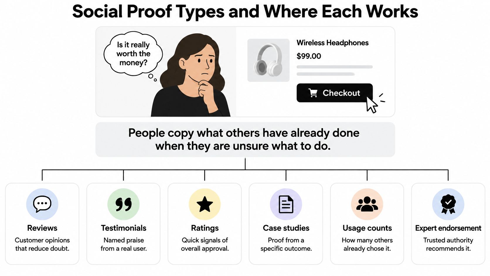
A testimonial belongs near the moment a visitor needs reassurance, often beside the main call to action. A review score helps people scan options quickly, while a case study earns its space when a buyer needs to understand how a solution performed in a specific situation. Customer logos can support a company's credibility, but they don't explain what those customers achieved.
Live activity counts can create momentum only when the figures are accurate and current. A made-up counter risks making the whole page feel dishonest. Expert endorsements should come from someone whose experience matters to the buyer, and user-generated content works best when visitors can tell who made it and what they're seeing.
For more practical guidance on choosing where to display customer testimonials, consider what the visitor needs to see immediately before acting. If you're refining the wording itself, these testimonial techniques for making feedback persuasive can help you turn broad compliments into specific evidence.
Start with the visitor's doubt, not the proof format. Choose the two types that best match your offer's price and the question most likely to stop someone from buying.
Why Social Proof Changes What Visitors Decide
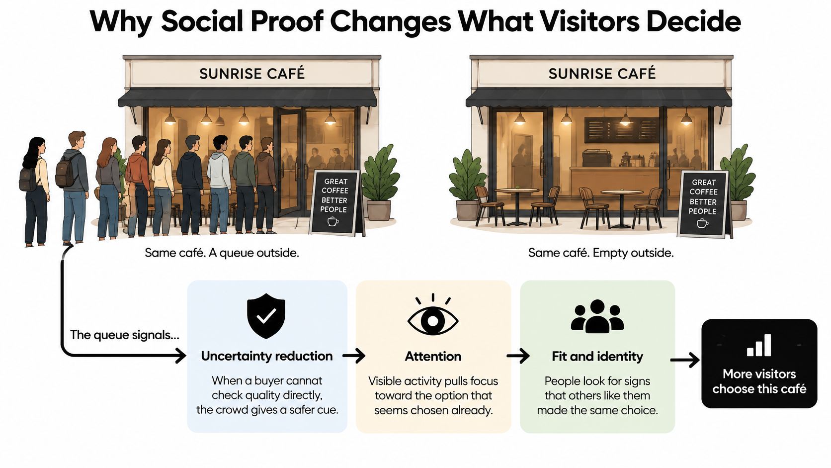
Think of two identical cafés on the same street. One has a queue outside, while the other is empty. You don't know whether the busy café serves better coffee, but the queue gives you a reason to consider it. A website visitor makes a similar judgment when choosing between unfamiliar products or companies.
Social proof works through a few simple mechanisms. The first is uncertainty reduction. Before buying, a customer may not be able to judge a product's quality directly. A detailed account from another buyer can help fill that gap, much like asking a friend whether they liked a café before you go.
Next comes consensus. Several independent accounts can feel more convincing than one polished statement from the company itself. When different customers describe specific experiences, a visitor can compare details and decide whether those experiences seem relevant.
Then there's similarity. People often want to know whether someone like them has made the choice. A new customer may find a review from a first-time buyer more useful than praise from a long-term fan. A small business owner may pay attention to another small business owner's experience rather than a large corporation's logo.
Reviews already play a role in how many buyers evaluate a company. In PwC's 2024 global consumer survey, 70% of consumers said they seek reviews to validate a company before making a purchase (PwC's Voice of the Consumer survey). That doesn't mean any review will persuade every visitor. A review that addresses the visitor's actual concern is more useful than praise that could apply to any product.
Before choosing what to display, write down the doubt your main audience brings to the page. It might be “Will this fit my team?”, “Can I trust the quality?” or “Will setup take too long?” Select proof that responds to that question plainly.
Where to Place Proof on Pages and Ads
Visitors meet your proof at different moments, and each placement has a different job. A detail that reassures someone before they click an ad may not be enough to help them complete a checkout. Follow the visitor's path and give each proof element a clear purpose.
| Location | Best proof | Why it helps |
|---|---|---|
| Ad headline or first line | Star rating or customer count | Confirms trust before the click |
| Landing page hero below headline | One specific testimonial | Answers whether the offer works for people like me |
| Next to the primary CTA | Short quote or guarantee-backed review | Reduces last-minute doubt |
| Pricing section | Logos and review average | Eases price concerns |
| Checkout or form page | Recent reviews or verified badge | Lowers abandonment |
| Footer or about page | Company credentials | Supports due diligence; usually low impact |
In the ad, a rating or customer count can give someone a quick reason to trust what they're seeing before they visit your page. Make sure the claim is accurate and that any number has a clear meaning.
In the landing page hero, place a specific testimonial beneath the headline. A short quote about an outcome helps visitors judge whether the offer might suit their situation. Keep it close enough to the main message that the connection is obvious.
Beside the primary call to action, use a brief quote that addresses a final concern. Someone who is almost ready to act may still wonder about the result or the risk; a relevant customer account can make the next step feel more considered.
In the pricing section, logos and an average review score can support a buyer who's weighing cost against credibility. Logos are stronger when nearby copy explains the relationship, rather than asking visitors to infer what a logo means.
On checkout or form pages, recent reviews or a verified badge can reassure visitors as they provide details or complete a purchase. Keep the reassurance close to the point where someone might stop.
In the footer or about page, credentials can support visitors doing deeper due diligence, but they're usually far from the immediate decision. Test these placements after you've looked at the points where visitors hesitate most.
For additional ideas on social proof tactics that boost conversions, focus on the connection between the proof and the action you want someone to take. If you're reviewing what visitors see before they scroll, this guide to above-the-fold landing page content can help you assess the first screen.
When testing placement, keep the proof itself the same and change only where it appears. Use your analytics to find the page or step where visitors hesitate most, and start there.
How Much Proof Looks Credible
More proof doesn't always look more believable. One glowing review can feel like a sales pitch, but several varied accounts can help a visitor spot a genuine pattern. The useful question isn't just how much proof you have. It's whether the amount, tone, and detail make sense together.
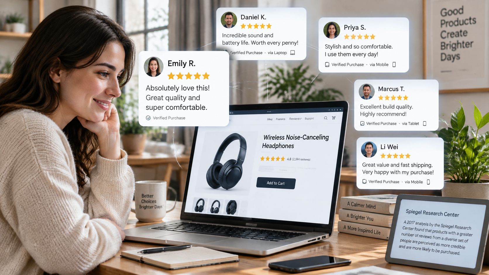
An analysis from Northwestern University's Spiegel Research Center, reported by Nudgify's social proof report, found that displaying five reviews increased purchase likelihood by up to 270% compared with displaying none, with a stronger effect reported for higher-priced products. Treat that figure as a directional benchmark, not a guaranteed lift. The result reflects a particular context, and the effect on your own page may differ with the product, audience, review quality, and placement.
Why perfect-looking proof can create doubt
An unusually strong rating paired with very few reviews can look suspicious rather than reassuring. A 2025 UCLA Anderson working paper found that consumers were suspicious of products with high ratings but few reviews. The paper also observed fake reviews in roughly 19% of products in its data (UCLA Anderson working paper on fake reviews).
That doesn't mean you should hide positive reviews or go looking for criticism to manufacture balance. It means visitors benefit from evidence they can assess. Keep reviews genuine, give them enough context to be useful, and don't smooth away every honest limitation.
Signals that help visitors judge authenticity
- Verified purchase labels: Make it easier to understand whether a reviewer bought or used the product.
- Concrete outcomes: A specific account of what changed is more useful than “Great product.”
- Visible responses to criticism: A clear, respectful reply shows that the company acknowledges feedback.
Use these signals to build a review display that feels informative rather than engineered. For example, a buyer might find “setup took an afternoon, and support helped with the last step” more believable than a page filled only with broad claims of effortless success.
Practical rule: Show enough varied reviews to suggest a pattern, and include an honest limitation or mixed review where your category allows it. Don't manufacture criticism or conceal material information.
Examples From Landing Pages and Ads
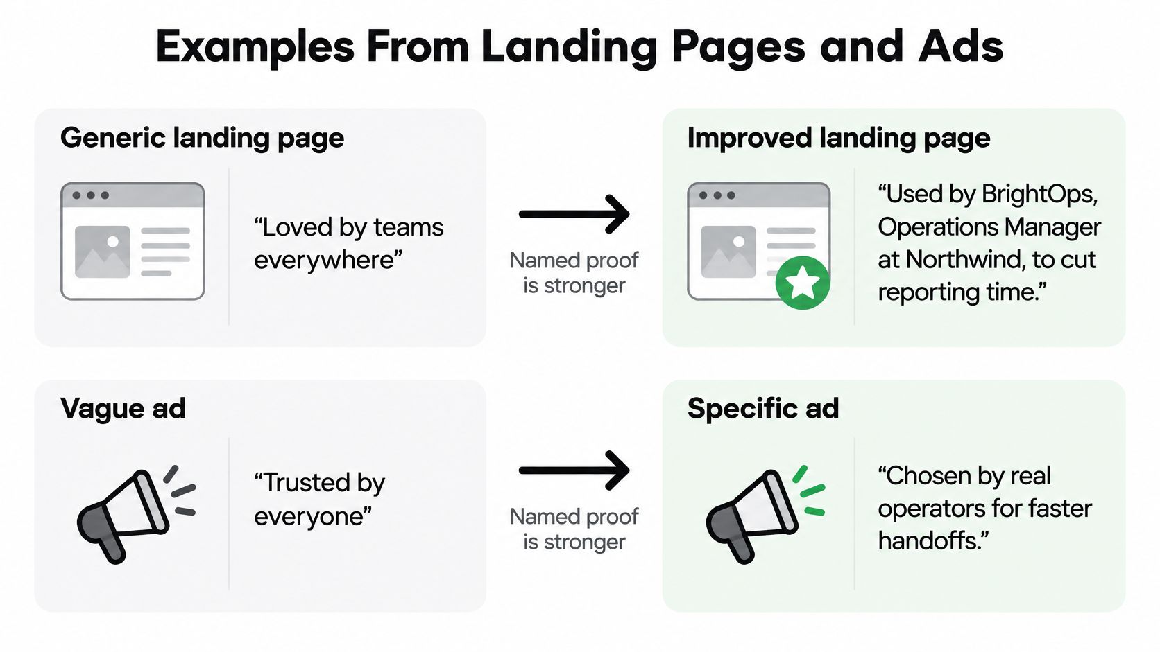
A project-management tool selling to operations managers might start with a page that says, “Loved by teams everywhere.” That line offers praise, but it doesn't show what the tool changed or whether it serves the visitor's kind of work.
Suppose the team has permission to use a real customer's account: a named operations lead explains how their team cut weekly reporting from six hours to one. Putting that detail beside the call to action gives the claim context at the moment a visitor considers acting.
Before and after
- Before: “Loved by teams everywhere.”
- After: A named operations lead describes the reporting task and the time saved.
- Doubt answered: “Will this save time for a team like mine?”
- Placement: Beside the primary call to action.
- Metric to watch: Click-to-purchase rate, with order quality as a guardrail.
The example describes a test, not a promised result. The customer's account should be accurate, approved for use, and specific enough for a visitor to understand what happened.
Now consider a skincare brand advertising to first-time buyers. An ad that shows a five-star average but no review count gives viewers little context. A version that displays the rating alongside its review count and a short, authentic quote about skin sensitivity may answer a more useful question for someone deciding whether to try the product.
- Before: Five-star average, with no indication of how many reviews support it.
- After: The rating, review count, and a brief quote that addresses skin sensitivity.
- Doubt answered: “Have people with concerns like mine tried this?”
- Placement: In the ad, beside the product.
- Metric to watch: Click-to-purchase rate, with returns as a guardrail.
A team building video variations may also consider tools for creating ShortGenius AI UGC video ads. Whatever format you choose, keep the customer's words and context accurate. Specific, checkable details are more useful than impressive adjectives.
An example video can help teams think about how proof appears in creative:
Testing Proof Variants With Conversion Data
A proof test should change one variable at a time and split visitors randomly between versions. If you change the testimonial, its placement, and the page headline in the same test, you won't know which change affected the result.
Before launch, record the baseline conversion rate and decide what smallest lift would be worth acting on. Use a standard sample-size calculator to estimate the traffic needed for that comparison, then choose a run length that gives the test a fair chance to include a full purchase cycle.
| Experiment | Versions compared | Primary metric | Guardrail metric |
|---|---|---|---|
| Review count | 0 vs 5 vs 20 reviews | Purchase conversion rate | Refund rate |
| Testimonial specificity | Generic praise vs named outcome | Conversion rate | Lead or order quality |
| Proof placement | Above vs below the CTA | Click-to-purchase rate | Time to purchase |
| Verified badge | Badge shown vs hidden | Conversion rate | Return rate |
| Source-matched proof | Same proof vs proof matched to the ad source | Revenue per visitor | Average order value |
| Balanced reviews | Positive-only vs one honest mixed review | Conversion rate | Retention after 30 days |
Choose one primary metric before traffic enters the test. That keeps the team from changing its definition of a winner after seeing the results. A secondary or guardrail metric helps catch outcomes that look good at first but could hurt the business later.
Keep quality beside the conversion result
A version can bring in more purchases and still be a poor choice if it also leads to more refunds or lower retention. For example, an impressive but vague claim might prompt visitors to buy, only for the product to fall short of their expectations. Look at the primary measure and its guardrail together, rather than treating conversion rate as the whole story.
Match the comparison to the question you want to answer. For review count, test the chosen counts while keeping the wording and placement consistent. For source-matched proof, compare the same general proof with a version that fits the campaign that brought the visitor in, without changing unrelated page elements.
For a practical walkthrough on running a landing page split test, keep the setup simple enough that the outcome is interpretable. Holdout groups can also help distinguish the effect of your change from the possibility that visitors who already trust the brand were more likely to convert.
Report the guardrail beside the winner. A conversion lift that comes with poorer order quality isn't automatically a win.
Polish writes the headline, the proof, the call to action and the order of content for each reader, in the customer's voice and inside the customer's design. In a proof test, that approach can support comparisons based on visitor source, device, country, or whether someone is new or returning. Keep the test question clear, and measure each segment separately so the result helps explain which proof fits which audience.
Confirm Your First Proof Test This Week
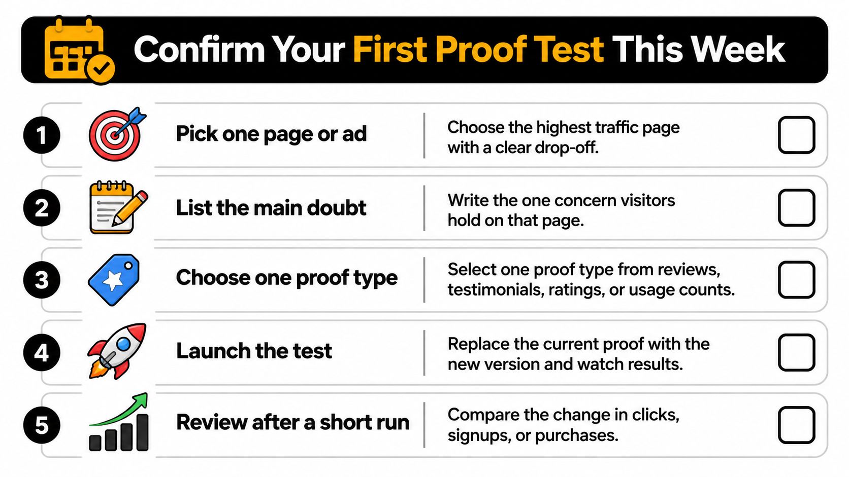
Start with one page or ad where visitors drop off. Write down the doubt that appears at that moment, then change only the proof you show them. A test that moves three things at once cannot tell you which proof worked.
- Choose a page or ad. Pick a high-traffic spot with a clear drop-off in analytics.
- Write down the main doubt. State the concern a visitor might have at that point, in their words.
- Select one proof type. Choose the format that directly addresses that concern. Check whether it looks credible as well as plentiful, because a wall of perfect ratings can read as staged.
- Create the control and variant. Keep the page the same and change only the proof.
- Set your metrics. Choose one primary outcome and one guardrail, such as conversion rate and refund rate.
- Decide the sample size and run length. Use a sample-size calculator before launch, then plan to evaluate the test over a full purchase cycle.
- Set a holdout group. Keep a comparable group outside the change so you can separate persuasion from selection effects.
Polish rewrites headlines, calls to action and copy, and serves the best-performing version to visitors. It measures visits with its own first-party pixel, fully independent of the customer's analytics stack. That setup can help teams run segment-level proof tests without manually building each version.
Schedule the test before the week fills up. Review results after the full purchase cycle, and read the guardrail beside the primary result before you call a winner.
Polish writes and tests landing-page headlines, proof, calls to action, and content order for different visitors, then serves the best-performing version. To test which proof fits your audience, visit Polish and explore how it can help personalize your landing page.
- social proof marketing
- social proof types
- landing page conversion
- testimonials and reviews
- conversion experiments
Your website rewrites itself until it converts.
Polish writes new versions of your headlines and CTAs, tests them on your real visitors and keeps the ones that win.
Start free