Above the Fold Guide: Landing Page Optimization
Learn what above the fold means for your landing page and how to optimize that prime area for higher conversions and better user engagement.
Published on 10 min read
Table of contents
- What Above the Fold Means for Landing Pages
- Why Above the Fold Still Drives Conversion
- Attention is not the same as conversion
- Above the Fold on Desktop vs Mobile
- Desktop gives space, mobile exposes priorities
- Where to Place Headlines, CTAs, and Trust Signals
- Start with the visitor's desired outcome
- Give the CTA a clear job
- Add one trust signal with a reason to believe
- What Actually Belongs Above the Fold
- What to leave below the fold
- How to Test and Optimize the Fold for Your Traffic
Above the fold is the portion of a webpage visible before scrolling, and it remains the most important real estate for conversion because it is where visitors decide whether to stay or leave. Nielsen Norman Group found that 57% of viewing time still happens above the fold, while 74% is concentrated in the first two screenfuls.
You know the situation. A campaign sends qualified traffic to a landing page, but the first screen shows a vague headline, a decorative image, and a CTA that says “Learn More.” The offer may be strong, yet visitors have to work to understand it. Some scroll. Many leave before the page gets a chance to make its case.
The mistake is treating above the fold as a rigid layout rule. It's better understood as a targeting problem. The right message and the right element placement depend on the visitor's device, intent, traffic source, and familiarity with your brand. A first-time visitor from paid search may need immediate context and reassurance. A returning visitor from email may need a faster path to action.
What Above the Fold Means for Landing Pages
A newspaper editor once had a physical constraint. Newspapers were folded in half at newsstands, so passersby could see only the top portion of the front page. Editors placed the strongest story, headline, and image in that visible area because it had to earn attention before a reader picked up the paper.
Web designers borrowed the metaphor in the 1990s. On a website, above the fold became the part of the page visible in the browser viewport before a visitor scrolls. By the late 1990s, it had become a standard UX and marketing concept for homepages and landing pages, according to this history of above-the-fold design.
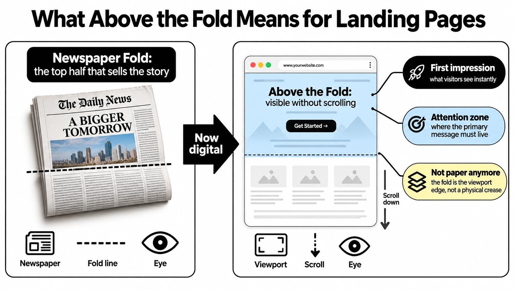
The physical fold disappeared, but the decision problem remained. A visitor still forms an initial judgment from what appears first. Does this page match the promise that brought them here? Is the offer relevant? Is the next step obvious? Above the fold is where the page earns enough trust and clarity to justify continued attention.
Early web behavior made that area even more important. In usability studies conducted from 1994 to 1996, users rarely scrolled, and sites often failed when key information sat below the fold, as documented in the same historical analysis. Modern visitors scroll more comfortably, but that doesn't make the first viewport irrelevant. It changes its job.
Practical rule: Treat above the fold as a message priority, not a pixel limit.
A strong landing page doesn't try to finish the entire sales argument in the first screen. It gives visitors a clear reason to continue. If you need a broader explanation of how landing pages work as conversion journeys, this guide to landing pages explained provides useful context.
Why Above the Fold Still Drives Conversion
Attention is unevenly distributed across a page. Nielsen Norman Group reported that 80% of viewing time was spent above the fold in 2010, while a later study still found 57% of viewing time in that area, according to its research on scrolling and attention. The same research found that 74% of viewing time was concentrated in the first two screenfuls, extending to approximately 2160 pixels.
That doesn't mean people refuse to scroll. It means the first screen gets the strongest opportunity to shape their interpretation of everything that follows. If the headline is unclear, visitors may never discover the comparison table, customer stories, or product explanation lower on the page.
The practical consequence is simple. Your hero needs to establish message alignment quickly:
- The headline should reflect the visitor's desired outcome, not merely describe your company.
- The subheading should add the missing context, such as who the offer is for or how it works.
- The CTA should make the next action feel proportionate to the visitor's current intent.
- The visual or trust signal should reduce uncertainty rather than compete with the message.
Early web-design research found that only about 10% of visitors scrolled at all, while more recent attention patterns show that the first screen still receives a disproportionate share of page-view time. Those findings point to the same operating principle: don't hide the reason to continue below the content that introduces the page.
Attention is not the same as conversion
A visible CTA isn't automatically an effective CTA. A button can occupy prime space and still fail if it asks for too much commitment, uses generic wording, or follows a headline that attracts the wrong audience.
Conversion work starts with matching the first screen to the promise made in the traffic source. A paid search visitor arriving for a specific solution expects immediate relevance. Someone arriving from a broad social post may need more product context before acting. The top of the page should answer the question the visitor brought with them.
For a wider set of practical methods, teams can use this resource on how to improve conversion rates. The useful takeaway isn't to place every persuasive element above the fold. It's to protect the limited attention available there for the elements that move a visitor from recognition to the next step.
Above the Fold on Desktop vs Mobile
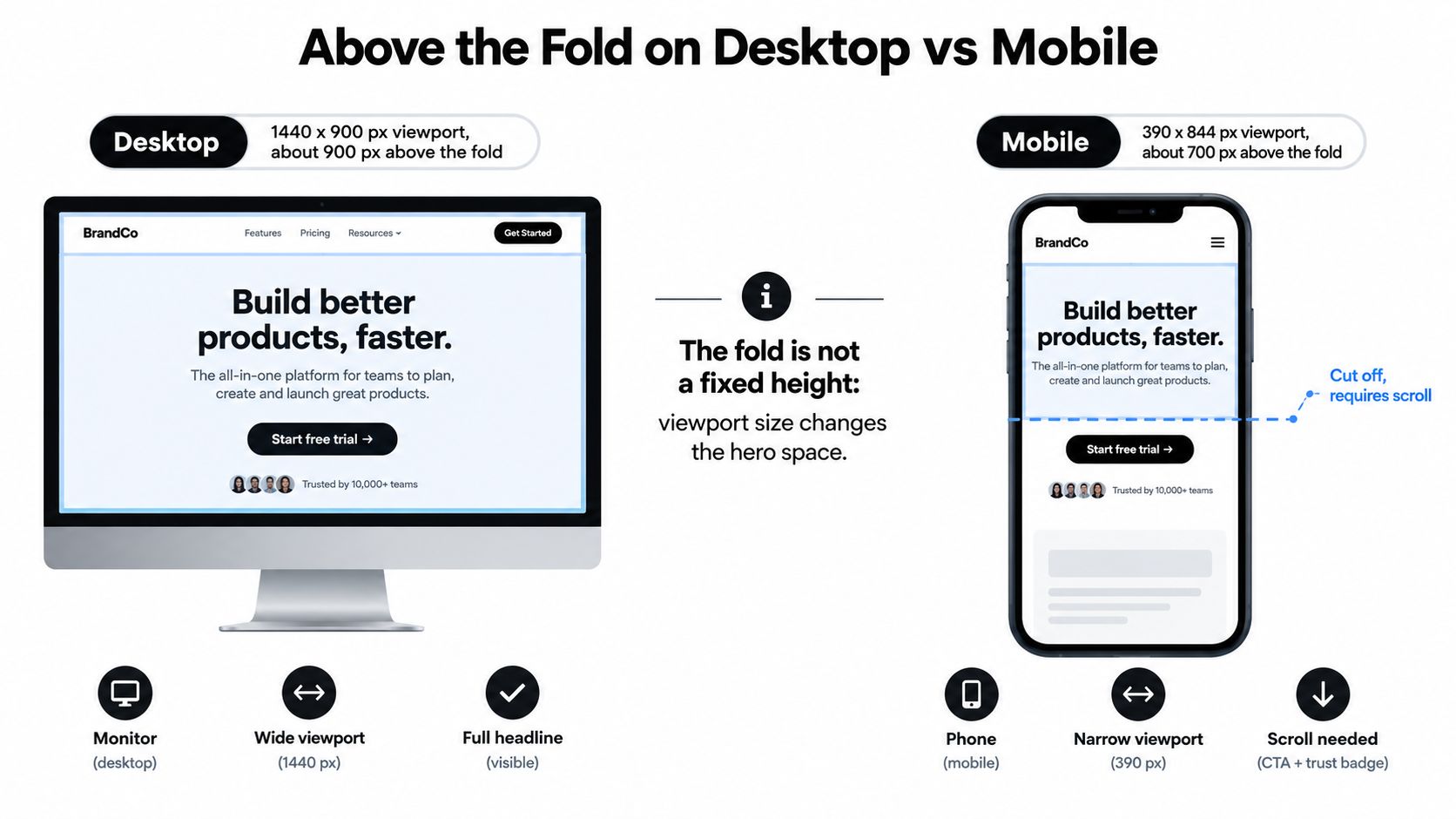
There is no universal fold. Above the fold means the portion visible inside the visitor's current browser viewport, and that viewport changes with the device.
On a mobile viewport measuring roughly 360 by 640 pixels, the visible area is approximately the first 600 pixels. On a typical desktop screen, the usable area may be about 800 to 900 pixels, as described in this responsive above-the-fold guide. A hero that shows the headline, product image, CTA, and trust badge on a desktop can push the CTA below the fold on a phone.
Desktop gives space, mobile exposes priorities
Desktop layouts often encourage excess. A marketer sees room for a headline, supporting copy, a product screenshot, navigation, customer logos, a form, and a secondary CTA. The composition can look balanced on a large monitor while becoming a long sequence of competing elements on mobile.
Mobile design forces a more useful question: what must the visitor understand before taking the next action? Usually, the answer is a focused headline, enough subheading context to qualify the offer, and a reachable primary CTA. A visual can remain, but it shouldn't push the decision-making elements out of view.
Design from the smallest high-volume viewport in your traffic mix first. Then check larger screens for unused space, rather than designing for desktop and treating mobile as a compressed afterthought.
The fold belongs to the visitor's device, not to your design file.
Use device-level analytics to find where the current hero breaks. Check whether mobile visitors see the full headline, whether the CTA appears without an awkward gap, and whether a sticky header consumes valuable space. Don't infer mobile behavior from a desktop preview. Validate the rendered experience on the devices that send you traffic.
Where to Place Headlines, CTAs, and Trust Signals
A reliable hero structure has four jobs. It identifies the benefit, supplies context, offers a next step, and lowers perceived risk. The order can flex by audience, but each element should earn its space.
Start with the visitor's desired outcome
Write the headline around the result the visitor came to achieve. “Analytics for growing teams” identifies a category. “See which campaigns turn visits into qualified pipeline” gives a growth leader a reason to keep reading.
The subheading should resolve the most important ambiguity. Explain the mechanism, audience, or constraint that the headline leaves open. Keep it specific enough to filter out poor-fit visitors, because clarity can improve the quality of clicks even when it reduces curiosity-driven activity.
Give the CTA a clear job
Use one primary CTA in the hero. Its wording should describe the next step in terms the visitor understands. “Start free trial,” “Book a product walkthrough,” and “See the audit” imply different commitments. Choose the one that matches the traffic source and buying stage.
Secondary navigation isn't automatically harmful, but a row of equally prominent buttons makes the page ask the visitor to choose before they understand the offer. Use visual hierarchy to make the intended path obvious.
Add one trust signal with a reason to believe
A trust signal might be a recognizable customer mark, a concise proof point, a security reassurance, or a relevant testimonial. Select one that addresses the hesitation most likely to block the next action. A decorative logo wall is less useful than a specific, legible reason to trust the product.
For supporting proof below the hero, these testimonial persuasive techniques can help you choose evidence that sounds credible rather than polished but empty.
Before publishing, inspect the heading hierarchy with RankEngine's heading checker. It won't replace conversion research, but it can catch structural problems that make the page harder to scan and less coherent for visitors and search engines.
What Actually Belongs Above the Fold
The best hero isn't the one that contains the most information. It's the one that answers the visitor's first important question quickly: why this offer, why now, and why trust it?
That answer varies by traffic source. A branded search visitor may already understand the category and need a direct CTA. An organic visitor landing on a broad informational query may need a sharper explanation of the product's relevance. A campaign visitor may expect the headline and visual to echo the ad or email that brought them there.
Recent guidance on above-the-fold essentials and conversion structure emphasizes a benefit-driven headline, a clear subhead, one primary CTA, and a trust signal. That combination works as a starting point because it covers meaning, context, action, and reassurance without forcing the hero to carry every objection.
What to leave below the fold
Detailed feature explanations, long comparison sections, implementation information, pricing nuance, and extensive customer proof usually belong lower on the page. They matter, but they serve visitors who have already accepted the basic value proposition or want to investigate before committing.
A crowded hero creates three common problems:
- The headline loses dominance: Visitors scan several messages instead of finding one clear promise.
- The CTA loses context: Multiple actions compete before the page has established value.
- The visual becomes decoration: Product screenshots and animations consume space without explaining the offer.
Personalization makes the targeting issue more visible. First-time visitors may need category context and a trust signal. Returning visitors may be ready for a direct action. Paid traffic may deserve message continuity from the ad, while organic traffic may require more explanation. The layout can remain familiar while the emphasis changes.
The fold should create momentum, not deliver the whole argument. Give visitors enough information to make the next decision, then let the rest of the page handle proof, objections, and detail.
How to Test and Optimize the Fold for Your Traffic
Start with segmentation, not a redesign. Group visitors by device, traffic source, campaign, country, and whether they are new or returning. Then inspect the first viewport for each meaningful group. A single desktop hero may be hiding a mobile-specific problem or serving the wrong message to a high-intent campaign.
Test one meaningful change at a time where possible:
- Test the promise: Compare a feature-led headline with a benefit-led headline that reflects the visitor's entry point.
- Test the commitment: Match the CTA to intent. A low-friction action may suit exploratory traffic, while a qualified campaign can support a more direct request.
- Test the reassurance: Try a product visual, customer evidence, or a concise trust statement, but don't add all three at once.
- Test the viewport: Review the hero on the smallest high-volume mobile viewport and on the desktop sizes that matter to your audience.
- Test the audience: Let first-time and returning visitors see different priorities when their objections or readiness differ.

Measure more than the button click. Check engagement with the next section, form starts, qualified submissions, and downstream outcomes. A headline variation that produces more clicks but worse-fit leads hasn't solved the targeting problem.
For a practical first-pass review, run the page through the landing page checker, then compare the findings with device-level analytics and session recordings. The fold is a dynamic optimization target. It should change as your traffic mix, campaigns, audience knowledge, and visitor intent change.
Polish reads your page and creates custom versions of the headline, subheading, and CTA for visitors based on factors such as traffic source, device, campaign, country, and visit history. Visit Polish to explore a personalization-first way to make the first viewport more relevant to each visitor.
- above the fold
- landing page
- conversion
- UX design
- CRO
Your website rewrites itself until it converts.
Polish writes new versions of your headlines and CTAs, tests them on your real visitors and keeps the ones that win.
Start free