8 Testimonial Persuasive Techniques That Convert
Learn 8 testimonial persuasive techniques for stronger social proof, credibility, placement, and conversion-focused landing pages.
Published on 21 min read
Table of contents
- 1. Expert/Authority Testimonials
- What authority should prove
- How to make it credible
- 2. Customer Success / Case Study Testimonials
- 3. User-Generated Content Testimonials
- 4. Video Testimonials
- 5. Comparative / Competitive Testimonials
- 6. Micro-Testimonials / Social Proof Snippets
- 7. Industry / Vertical-Specific Testimonials
- 8. Quantified / Metric-Based Testimonials
- 8-Testimonial Persuasive Techniques Comparison
- Turn Praise Into Proof That Moves Decisions
Most testimonial advice is too shallow to help on an actual landing page. “Add customer quotes” isn't a persuasion strategy. It's decoration unless the quote answers a real objection, comes from someone the buyer recognizes as relevant, includes enough context to feel believable, and appears where the buyer is hesitating.
That's why good testimonials still fail. Teams collect praise, drop it into a carousel, and assume trust will rise on its own. But vague approval doesn't move a decision. Buyers ask four silent questions instead. Who is speaking? What exactly does this prove? How specific is the evidence? Why is this quote showing up here, on this part of the page, right before this action?
Useful testimonial persuasive techniques are built around those questions. Some borrow authority. Some provide measurable proof. Some create relevance by matching industry, role, or use case. Some work because of format, especially when a real person appears on camera. Some only start working when placement improves and the testimonial sits next to the claim or CTA it supports.
That lens matters even more on landing pages for Polish, where buyers care about copy quality, testing discipline, and proof that optimization claims aren't just polished marketing. If you need a practical starting point for collecting stronger source material, these OrderBoosts Review Campaign Tips are useful.
1. Expert/Authority Testimonials
Authority testimonials work when the speaker's expertise matches the risk in the buying decision. If you sell a technical, strategic, or high-judgment product, a quote from a respected operator can reduce skepticism faster than a generic customer compliment.
That doesn't mean chasing famous names. A recognizable expert who comments on the wrong thing adds very little. A lesser-known but highly relevant head of growth, CRO consultant, or lifecycle lead often persuades better because the prospect sees direct overlap between the endorser's job and the product's promise.

What authority should prove
For products like ConvertKit, HubSpot, Optimizely, or a landing page tool, the best expert testimonials don't say “this is great.” They validate judgment. A creator educator can speak to audience fit. A CRO consultant can speak to testing quality. A growth leader can speak to message clarity and conversion readiness.
On a Polish landing page, that means the authority testimonial should connect to message quality, experimentation, or value communication. If the page is making a positioning claim, support it with someone who understands positioning. If the page is making a performance claim, pair authority with customer evidence, not authority alone.
Practical rule: Use experts to validate the category judgment. Use customers to validate the lived result.
How to make it credible
The structure matters as much as the person. Show the endorser's full name, role, company, and why their opinion should matter to this buyer. If you hide identity details, the authority transfer weakens fast.
A stronger format looks like this:
- Match expertise to claim: A messaging strategist should comment on positioning clarity, not experimentation velocity.
- Show visible credentials: Include title, company, and a real headshot if permission allows.
- Keep the quote narrow: One precise observation beats broad applause.
- Support with adjacent proof: Put the quote near the claim it strengthens, not in an isolated “testimonials” strip.
If your page is still refining its promise, the customer value proposition guide from Polish helps anchor what the testimonial should reinforce.
2. Customer Success / Case Study Testimonials
Case study testimonials earn their place when praise is not enough.
A buyer who already believes your product is plausible still has a harder question to answer: “Can I defend this choice with specifics?” That is the persuasion job here. Customer success stories give buyers a chain of reasoning they can reuse with a manager, a client, or themselves. Problem, change, result, and the conditions around that result.

The trade-off is simple. The more detail you include, the more credible the story becomes for serious buyers. The more detail you include, the fewer visitors will read all of it. That is why case study testimonials work best as a layered proof asset on a landing page, not as a wall of text.
For Polish, this format is strongest when it explains a messaging decision, not just a happy outcome. A weak version says a team got better conversions. A useful version shows what they changed on the page, which audience they were trying to persuade, what friction the original message created, and what happened after the new version shipped. That makes the testimonial relevant to headline choices, CTA framing, and proof placement, which is exactly where landing page decisions get made.
Here is the structure I would use on-page:
- Start with the buyer's starting condition. Low conversion, unclear positioning, weak message match, or internal disagreement about what to test.
- Add operating context. Team type, audience, page type, and whether the change was a rewrite, a test, or a broader positioning update.
- Pull one direct quote that sounds like an operator, not a marketer. Keep their wording intact unless you need light edits for clarity.
- Attach the outcome to the change. If the result was directional rather than dramatic, say that plainly.
- Give interested visitors a path to the full story.
This approach protects credibility. Buyers can see enough to judge relevance quickly, but they are not forced into a long read before they reach the CTA.
A good case study testimonial also helps with comparison. If a prospect is weighing Polish against doing messaging work manually, using a generic CRO tool, or relying on internal opinion, the story should make that comparison legible through the customer's experience. Show what the team was struggling to diagnose, what changed in their workflow, and why the new page performed better or got approved faster. If you are shaping the page around that kind of proof, this landing page optimization guide is a useful companion.
For inspiration on story structure, these influencer marketing case study examples show how to turn outcomes into a readable narrative instead of a brag sheet.
One implementation detail matters more than teams expect. Put the short version near the decision point, then let the deeper case study sit one click away or in an expandable module. That placement respects two audiences at once: fast evaluators who want a credible signal, and careful evaluators who need enough detail to justify action.
3. User-Generated Content Testimonials
Polished testimonials are often the wrong tool for the job.
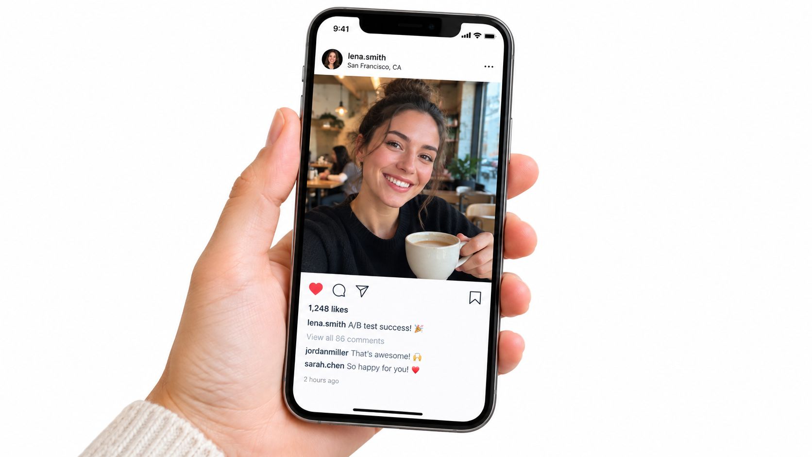
User-generated content does a different kind of persuasion work. It borrows trust from context. A LinkedIn post, G2 review, forum reply, or customer-recorded walkthrough carries signals your brand did not script, and buyers notice that distinction fast.
That does not mean every rough post should go on the page. The trade-off is control versus credibility. The more you clean up the language, crop the platform cues, and rewrite the point into brand voice, the easier it is to fit your design system. It also becomes easier for a skeptical buyer to dismiss it as marketing.
Recent marketing coverage has focused on automated testimonial selection and personalized proof widgets. A weaker part of that conversation is authenticity risk. As one review notes, the trust tradeoff around AI-generated and overly polished testimonial systems is still undercovered.
Buyers forgive rough edges faster than they forgive anything that feels manufactured.
A useful way to judge UGC is to ask what persuasion job it performs on the page.
If the job is borrowed authority, preserve the source. Keep the post format, profile cues, or review platform context when permission allows. If the job is relevance, choose examples that match the visitor's role, team size, or use case instead of featuring the loudest praise. If the job is friction reduction, place UGC beside the moment where doubt shows up, not in a testimonial gallery nobody opens.
For Polish, that usually means using UGC around workflow questions. A screenshot of a founder sharing a headline test, a marketer posting before-and-after messaging iterations, or a short comment about getting stakeholder approval faster can work harder than a generic quote about loving the product. The point is not polish. The point is recognizability.
Three implementation choices matter here:
- Ask for permission, then edit lightly. Correct formatting issues if needed, but keep the original phrasing and point of view.
- Match UGC to page intent. Put process-oriented proof near signup or product detail sections. Put broader sentiment higher on the page if visitors are still judging legitimacy.
- Show range without creating noise. One post from a solo founder and one from an in-house growth lead can increase relevance. Ten disconnected screenshots usually weaken focus.
Brands like Slack, Notion, Stripe, Figma, and Zapier benefit from this format because people already talk about them in public. The lesson is not to copy their volume. It is to use public customer language as evidence, then place it where it answers a real objection.
If you stage UGC too heavily, it stops functioning as peer proof and starts functioning as ad creative. Buyers can tell the difference.
For teams shaping Polish landing pages, UGC fits best where visitors need to see how real users describe the work in plain language. That could be beside a CTA, under a claim about faster iteration, or next to a feature that needs social confirmation to feel believable.
4. Video Testimonials
Video is not automatically stronger proof. It only wins when the clip does a job text cannot do as well: show that the person is real, credible, and specific under light scrutiny.
That job matters when a visitor is close to a decision but still doubts whether the claimed outcome will hold up in practice. In a written quote, marketers can smooth rough edges. In video, buyers can judge pace, conviction, hesitation, and whether the answer sounds memorized. That added scrutiny is the persuasive asset.
A video testimonial earns its place on a landing page by reducing one of two risks. First, trust risk. Is this customer legitimate? Second, interpretation risk. Did the result come from the product, or from editing and selective phrasing?
The trade-off is production friction. Video usually gets fewer submissions, takes longer to approve, and can feel promotional faster than text. A weak clip lowers trust because visitors notice the staging, the script, or the vagueness immediately.
The safest standard is simple. If the customer cannot explain their starting point, what changed, and what result they saw within the first few moments, the video probably belongs in a case-study library, not on a high-intent landing page.
One marketing benchmark reports that video testimonials produced an 80% conversion-rate lift versus text-only reviews. Treat that as directional, not as a guaranteed outcome. Format helps when it matches the objection on the page.
For Polish, that usually means pairing video with decision-heavy sections, not treating it as a brand film. A strong clip can help a buyer believe that message testing changed results because they can hear how the team made the call, what they were skeptical of, and what evidence changed their mind.
Three landing-page decisions shape whether video helps:
1. Choose the persuasion job before the shoot.
Use one clip to prove credibility, another to prove workflow fit, another to prove measurable impact. Trying to cover every angle in one testimonial usually produces a vague two-minute summary.
2. Edit for decision relevance, not polish.
Cut long introductions. Keep the sentence where the customer names the old problem, the evaluation logic, and the outcome. Small imperfections often increase believability.
3. Design for skimmers.
Add captions, a sharp thumbnail, and a one-line text takeaway beneath the player. Many visitors will not press play, so the surrounding page still needs to carry the proof.
A useful Polish example would be a demand gen lead saying the team had competing headline assumptions, tested them on the page, and found that the winner was not the internally preferred message. That kind of clip does more than add social proof. It shows how the product fits an actual decision process.
Good video testimonials do not summarize the brand. They document a buyer reasoning through change in a format that is harder to fake and easier to trust.
5. Comparative / Competitive Testimonials
Comparative testimonials do a different persuasion job than praise. They help a buyer justify change.
That matters because late-stage visitors are rarely asking, "Is this good?" They are asking, "Why switch from what we already use, and what gets better if we do?" A testimonial that answers that question can reduce more friction than a generic success quote, especially on comparison pages, migration flows, pricing pages, and sales-led landing pages.
The useful comparison is usually not competitor versus competitor. It is current state versus new state. Sometimes that means replacing another tool. Often it means replacing a spreadsheet, a slow approval loop, or a manual testing process that no one wants to defend but no one wants to rebuild either.
For Polish, comparative proof earns its place on the page. The strongest quotes explain what changed in the decision process itself. A team stopped debating headlines based on opinion. A marketer replaced one-off copy changes with structured testing. A growth lead got faster feedback on which message deserved traffic. Those details help a visitor evaluate fit without forcing the brand into exaggerated head-to-head claims.
Two choices determine whether this format builds trust or triggers skepticism.
First, keep the comparison centered on buyer reasoning. Direct competitor attacks can attract attention, but they often weaken credibility because they sound written for the brand, not spoken by the customer. A cleaner quote names the old setup, the problem that pushed the team to reconsider it, and the practical reason the new option won.
Second, leave some texture in the story. Good comparative testimonials often include a trade-off: setup took planning, the team had to change its review process, or the switch mattered because it reduced a specific bottleneck rather than fixing everything at once. That kind of constraint makes the claim easier to believe.
A comparative testimonial usually gets stronger if it covers four points in plain language:
- What the team used before. Previous platform, internal workflow, agency-led process, or manual testing.
- What forced reevaluation. Slow iteration, poor visibility, weak collaboration, unclear winners, or too much dependence on opinion.
- What changed after switching. Faster decisions, easier experiment management, clearer message selection, or better alignment across teams.
- What kind of team this applies to. Demand gen, lifecycle, product marketing, or a lean in-house growth team.
That structure gives the quote a job beyond social proof. It helps the visitor map their own situation to the customer's situation.
Placement matters too. Comparative testimonials belong beside high-intent decisions, not buried in general brand storytelling. On a Polish landing page, use them near migration messaging, feature comparisons, pricing explanations, or any section where the reader is weighing the cost of changing an existing process. A short line about "why we left the old workflow" can do more there than a longer quote about general satisfaction.
Used well, comparative testimonials do not ask the reader to admire the product. They let the reader borrow someone else's decision logic. That is often the last proof a hesitant buyer needs.
6. Micro-Testimonials / Social Proof Snippets
Long testimonials often get too much credit. On high-intent landing pages, a two-line quote can do more persuasive work because it answers a smaller question at the exact moment a visitor hesitates.
That is the job of a micro-testimonial. It does not need to tell the full customer story. It needs to reduce friction around one decision. Click the CTA. Trust the claim. Finish the form. Keep reading.
Used well, these snippets support five different persuasion jobs:
- Borrowed credibility: a recognizable name or role signals that a real operator stands behind the claim
- Claim support: a short quote placed under a headline or feature statement makes the promise feel less self-reported
- Risk reduction: a line beside a form or signup button lowers anxiety by showing that someone else took the same step and got value
- Message clarification: a brief customer phrase can explain the practical benefit faster than branded copy
- Momentum preservation: the page keeps moving because the proof is easy to scan
The trade-off is obvious. Short proof is fast, but it has almost no room for vague praise. If the quote says only "great product" or "highly recommend," it fills space without helping the buyer decide anything.
A useful snippet usually earns its spot with three pieces of information: who said it, what they used the product for, and what changed. The outcome does not always need a number. It does need a concrete point of reference. "We stopped debating homepage copy in review meetings" carries more weight than "our team loves it."
This also changes how marketers should edit. Do not compress a strong testimonial until all the specifics disappear. Cut setup, keep the decision trigger. Keep the phrase that reveals use case. In practice, the best micro-testimonials often sound slightly less polished than brand copy, and that helps credibility.
Placement should follow the objection, not a design template.
Under the hero, a snippet can validate the core promise before the visitor scrolls. Next to a primary CTA, it can answer the quiet question of whether signing up is worth the effort. Beneath a bold claim, it can keep the page from sounding self-congratulatory. Inside pricing or plan sections, it can reassure buyers who are comparing commitment levels and trying to judge whether the product will pay off quickly enough.
For Polish, this format is especially useful in tight areas where the page needs proof without losing pace. A short line near the headline can reinforce the value of ongoing message testing. A snippet beside the CTA can reassure skeptical teams that the product helps them make copy decisions faster. Near a form, use quotes that reduce perceived effort, not broad brand praise.
One caution matters here. Rotating too many snippets, over-styling them, or stacking five weak quotes in a row turns social proof into wallpaper. One precise line in the right place usually converts better than a carousel full of approval.
7. Industry / Vertical-Specific Testimonials
A testimonial does not fail only because it is weak. It also fails when the visitor has to translate it.
That is the job of vertical-specific proof. It removes the question, "Does this apply to a company like mine?" before the buyer asks it. In a testimonial system, this is the relevance layer. Authority can get attention. Metrics can support the claim. Relevance decides whether the proof feels usable.
A SaaS growth lead reads for trial quality, activation, and experiment speed. An ecommerce team scans for product-page clarity, merchandising friction, and checkout objections. An agency buyer looks for client approval cycles, reporting, and delivery speed. If all three see the same generic quote, each has to fill in the missing context alone. That extra interpretation cost weakens the page.
Broad proof can still help early on, but segment-specific proof usually closes better because it shortens the distance between the claim and the reader's actual workflow.
Here is the trade-off. The more specific the testimonial becomes, the narrower its coverage. A quote from a marketplace operator may convert marketplace visitors well and do very little for B2B services traffic. That is not a flaw. It is a placement decision.
For Polish, this matters at the page level. A general homepage can carry a small set of broadly legible proof. Vertical landing pages should switch to customer language that matches the reader's operating model. SaaS pages should sound like SaaS teams. Ecommerce pages should sound like ecommerce teams. Agency pages should sound like people balancing client feedback, testing volume, and turnaround time.
A useful filter is simple: if the visitor can recognize their team in the first line of the quote, keep it. If they need three sentences to figure out whether the example fits, rewrite or move it.
Implementation usually breaks in the content ops, not the design. Tag each testimonial by industry, role, company type, and primary outcome. Then build a small proof library that marketers can swap into landing pages, pricing sections, and campaign pages without rewriting the whole page each time. Include enough context to help self-selection. Company stage, team function, and use case do more work here than polished praise.
The best vertical testimonials also preserve native language. A strong ecommerce quote should mention category pages, PDPs, bundles, or checkout if those details drove the result. A strong SaaS quote should sound like someone responsible for signups, activation, or pipeline quality. Once marketers sand off those specifics to make the quote feel universal, they usually remove the very detail that made it persuasive.
One warning. Over-segmentation can create thin proof. If a page targets a narrow audience and the only testimonial is weak, dated, or vague, a stronger adjacent-industry quote may outperform it. Relevance helps only when the underlying testimonial still carries substance.
Used well, vertical-specific testimonials do one job better than any other format in this list. They make the proof feel immediately transferable to the buyer's own page, team, and conversion problem.
8. Quantified / Metric-Based Testimonials
Big numbers do not make testimonials stronger. Interpretable numbers do.
This format handles a specific persuasion job: measurable proof. It helps buyers answer a harder question than "Do people like this?" They want to know what changed, how much, under what conditions, and whether that outcome could happen on a page like theirs.
A weak quantified testimonial usually fails at one of two points. It either strips out the operating context, so the result sounds inflated, or it crams every detail into a single line and becomes unreadable. Both problems hurt conversion. Buyers cannot apply the claim to their own decision.
The fix is to treat the quote like evidence, not decoration. A usable metric-based testimonial gives four things: the outcome, the baseline, the scope, and the source of the improvement. On a Polish landing page, that often means tying the result to a page type, test setup, traffic segment, or message change instead of presenting a detached lift number. Teams running adaptive experiments should also understand how traffic allocation affects reported outcomes. Polish explains that in its guide to multi-armed bandit testing.
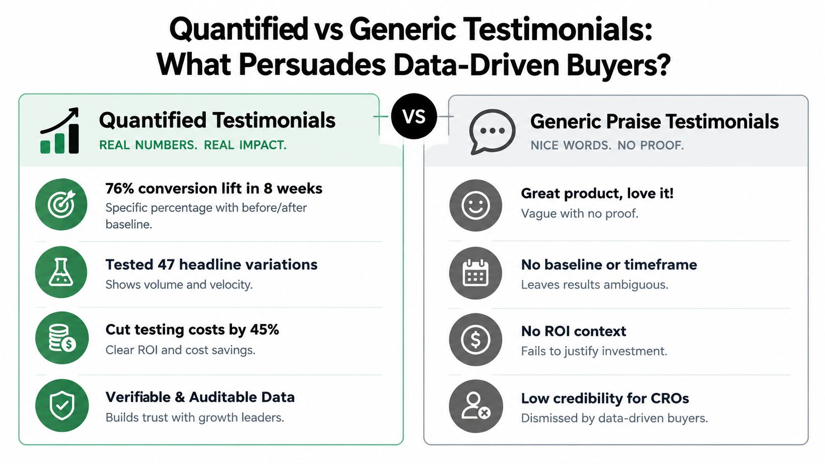
Here is the trade-off. The more precise the claim, the more scrutiny it attracts. That is usually good, but only if the testimonial can survive follow-up questions. "Increased conversions by 23.4%" sounds impressive until the buyer wonders over what period, on how much traffic, with what offer, and whether the result held after the test ended. A cleaner version often converts better: a rounded result, tied to a named page and a clear timeframe, with the speaker identified.
For landing-page decisions, this format works best in places where visitors are already comparing risk and expected return. Pricing pages, high-intent product pages, test explainer sections, and sales-assist pages are strong placements. It tends to underperform in hero sections if the quote reads like a spreadsheet. There, one grounded number plus a clear statement of what changed usually carries more weight than a dense stat block.
A practical review standard helps:
- Can a buyer tell what improved?
- Can they tell where it improved?
- Can they tell whether the result came from message, proof, testing process, or something else?
- Can they judge whether the example is close enough to their own page to matter?
If the answer to any of those is no, the testimonial needs editing, not bolder formatting.
The goal is not to sound scientific. The goal is to make the proof usable. Quantified testimonials earn their place when they reduce uncertainty for careful buyers and give the marketing team a claim that can hold up under scrutiny.
8-Testimonial Persuasive Techniques Comparison
| Testimonial Type | 🔄 Implementation complexity | ⚡ Resource requirements | 📊 Expected outcomes | 💡 Ideal use cases | ⭐ Key advantages |
|---|---|---|---|---|---|
| Expert / Authority Testimonials | Medium–High, sourcing, vetting, coordination | High, often paid endorsements and legal checks | High credibility and trust; reduces perceived risk | B2B, enterprise, and high‑ticket purchase pages | Authority transfer; strong trust signal |
| Customer Success / Case Study Testimonials | High, in‑depth interviews and storytelling | High, data collection, editing, and design time | Concrete ROI proof; persuasive to decision makers | Sales enablement, proposals, long‑form landing pages | Measurable outcomes; supports sales conversations |
| User‑Generated Content (UGC) Testimonials | Low–Medium, organic capture and moderation | Low, inexpensive but needs community management | High authenticity, social engagement, ongoing content flow | Social campaigns, awareness, viral amplification | Perceived authenticity; cost‑effective; sharable |
| Video Testimonials | High, filming, editing, and direction | High, production, hosting, and participant coordination | Strong emotional connection; higher time on page and conversions | Landing pages, ads, product demos, case stories | Memorable, emotive proof; multi‑channel repurposing |
| Comparative / Competitive Testimonials | Medium, careful wording and legal review | Medium, interviews plus messaging strategy | Directly addresses objections; clarifies differentiation | Comparison pages and late‑stage evaluation content | Shows competitive advantage via customer voice |
| Micro‑Testimonials / Social Proof Snippets | Low, short quotes or pull‑quotes | Low, easy to create and rotate frequently | Quick trust bump in tight spaces; reduces friction | CTAs, ads, above‑the‑fold snippets, form areas | High impact per space; easy A/B testing and refresh |
| Industry / Vertical‑Specific Testimonials | Medium, collect segmented examples | Medium, diverse customer outreach and curation | Increased relevance; higher conversion for target visitors | Vertical landing pages, targeted campaigns, sales calls | Relevance‑driven persuasion; reduces "doesn't apply" objection |
| Quantified / Metric‑Based Testimonials | High, requires data verification and baselines | High, analytics, customer validation, and legal review | Strong persuasion for data‑driven buyers; clear ROI expectations | CROs, heads of growth, enterprise procurement | Concrete, auditable metrics; directly ties to business impact |
Turn Praise Into Proof That Moves Decisions
The strongest testimonial systems don't start with design. They start with collection discipline. Gather source material from real customer conversations, reviews, social posts, support exchanges, win-loss calls, and structured interviews. Look for the lines buyers use when they explain the problem, the switch, the hesitation, and the result. Those lines are usually more persuasive than anything a copywriter invents later.
Then choose the testimonial type that matches the objection on the page. If the visitor doubts your judgment, use authority. If they doubt the practical result, use customer success proof. If they doubt authenticity, use peer voice or UGC. If they need relevance, narrow by vertical, role, or use case. If they're close to acting, use a short proof snippet near the CTA. If they need hard evidence, use a quantified testimonial with enough context to be credible.
Keep the original wording whenever possible. That matters more now because buyers have seen too much polished proof. Overediting removes friction, but it also removes the human texture that makes a testimonial believable. Preserve how the customer speaks, then add the supporting detail that helps the reader trust it: full name, role, company, use case, and any evidence the customer is comfortable attaching.
Placement is where many teams still waste strong material. Don't isolate all proof on a generic testimonials page and expect it to do conversion work from a distance. Put the proof beside the claim it validates. If the page asks for signup, support the signup. If the page introduces pricing, reduce pricing anxiety. If the page compares alternatives, show why someone switched.
Performance review should follow the same logic. Don't ask only whether testimonials increased page-level conversion. Check whether the right testimonial improved click-through to the next step, reduced hesitation at forms, or increased confidence on pricing and comparison sections. A testimonial often works as a trust object before it works as a closing device.
The best system combines formats instead of repeating one everywhere. Authority helps with borrowed credibility. Case studies provide logic. UGC adds realism. Video adds human presence. Vertical proof adds relevance. Snippets maintain momentum. Metrics satisfy scrutiny. Together, they turn praise into evidence.
Polish fits naturally into that process because testimonial performance is tied to surrounding copy, not separate from it. A quote can underperform because the headline overpromises, the CTA feels premature, or the proof appears too far from the decision moment. Testing testimonial wording and placement alongside headline and CTA variations is often where the page becomes more persuasive as a whole.
Polish helps teams test the full persuasion stack on landing pages, not just isolated copy lines. It reads your page, writes new headline, subheading, and CTA variants, serves them to visitors, and measures which combinations convert better. If you want to see how stronger proof works with stronger messaging, visit Polish.
- testimonial persuasive techniques
- testimonial marketing
- social proof
- conversion optimization
- landing page copy
Your website rewrites itself until it converts.
Polish writes new versions of your headlines and CTAs, tests them on your real visitors and keeps the ones that win.
Start free