Pages Optimized for Web: A Practical 2026 Guide
Make your pages truly optimized for web performance, accessibility, SEO, and conversion. Practical steps, real benchmarks, and fixes for 2026.
Published on 10 min read
Table of contents
- What Optimized for Web Means in 2026
- Speed as the First Optimization Layer
- What metrics to watch
- Responsive Design Beyond Breakpoints
- Build from the component, not the viewport
- Keep the message visible
- Accessibility as a Conversion Lever
- The highest-ROI fixes
- Matching the Page to the Visit, Not the Visitor
- What changes in practice
- Your Prioritized Optimization Roadmap
- Sprint 1 foundation
- Sprint 2 refinement
- A simple 30-day recap
A page that loads slowly loses the visit before the copy even has a chance. Google's mobile research showed that 53% of mobile visitors abandon pages that take longer than 3 seconds to load, and the same analysis found mobile landing pages averaged about 15 seconds to fully load Google mobile page-speed research. That is why “optimized for web” in 2026 is not a design slogan, it's a system for protecting intent, attention, and conversion on every visit.
What Optimized for Web Means in 2026
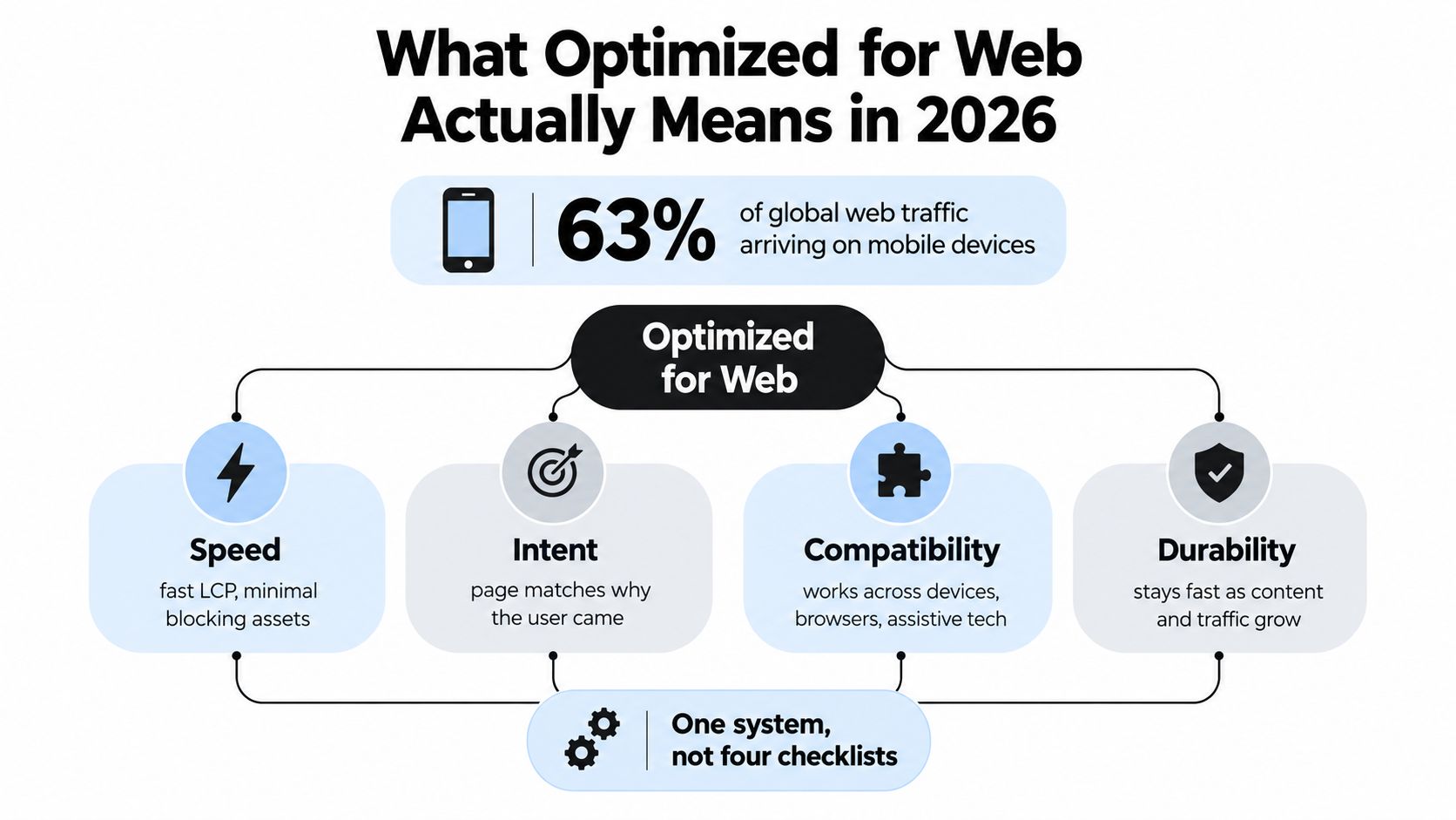
The old definition of optimized for web was easy to repeat, make the page load, make it responsive, and make the CTA obvious. That is too narrow now. A visit arrives through paid search, organic search, email, retargeting, or direct traffic, and each path brings different intent, device constraints, and trust.
The better model is a system with four lenses, speed, responsive design, accessibility, and conversion. Each one affects the others. A fast page that is hard to tap still loses revenue. A polished page that ignores assistive technology leaves people out. A compliant page that misses the visitor's context wastes media spend.
Practical rule: start with the visitor's source, device, and likely intent, then shape the page around that visit.
Core Web Vitals used to be a ranking conversation. In 2026, they sit much closer to a revenue conversation because they decide how much of the visit survives long enough to convert. Google's speed research and the ongoing mobile performance data point in the same direction, slow pages leave less room for every other improvement to work.
Modern stacks are heavier, and that changes the job. Third-party scripts, personalization tools, and recommendation layers raise the cost of each visit. A single fixed layout cannot serve a branded paid-search click, a comparison-blog reader, and a returning customer in the same way.
For planning and content structure, I also pull a few ideas from TheContentMap editorial planning tips, especially when a team needs to map intent before writing. The shift is simple, stop optimizing “the page” in the abstract and start optimizing the visit.
Speed as the First Optimization Layer
A slow page loses the visit before the message has a chance to land. Mobile performance research from the HTTP Archive shows that load-time friction still pushes abandonment early, and the request stack is often the problem, not the copy Google mobile page-speed research. If the shell is slow, every later improvement has less room to work.
The first pass should target the heaviest blockers, not the prettiest details. Render-blocking CSS delays first paint. Unoptimized media adds weight. Third-party tags from analytics, chat, A/B testing, and ad platforms multiply requests. Slow origin responses raise TTFB, so the browser waits while the visitor stares at a blank or half-built page.
The fastest gains usually come from removing friction rather than polishing pixels.
- Inline critical CSS: ship only what the first screen needs.
- Defer nonessential scripts: especially tags that do not affect the first interaction.
- Subset fonts: keep the character set to what the page uses.
- Cache aggressively at the edge: repeat visits should not pay the same network cost again.
Keep the first view boringly efficient. Fancy interactions can wait until the page is already useful.
What metrics to watch
For 2026, the working targets are still the familiar Core Web Vitals thresholds, LCP under 2.5 seconds, INP under 200 milliseconds, and CLS under 0.1. Those numbers matter because they map to the user's experience of loading, responsiveness, and visual stability. The goal is not cleaner dashboards. It is a visit that feels immediate enough to keep moving.
| Metric | Good | Needs Improvement | Poor | Typical Mobile Conversion Impact |
|---|---|---|---|---|
| LCP | under 2.5s | 2.5s to 4.0s | over 4.0s | Faster first view usually protects more clicks and starts more sessions |
| INP | under 200ms | 200ms to 500ms | over 500ms | Better interaction speed reduces frustration at form and CTA points |
| CLS | under 0.1 | 0.1 to 0.25 | over 0.25 | Stable layouts help prevent accidental taps and aborted actions |
If you want a fast sanity check before engineering starts a deeper review, use the landing page checker to spot obvious bottlenecks. The useful habit is to measure real mobile traffic, not only lab tests, because lab results often miss the script and network issues that show up in the wild.
Responsive Design Beyond Breakpoints
Responsive design fails when teams treat it like a set of screen widths instead of a set of decisions. The essential work is deciding what gets priority on a small screen, how the CTA is reached, and what can collapse without harming intent. Breakpoints matter, but only after the layout has already made those choices.
Build from the component, not the viewport
Start with container queries and fluid typography so elements adapt to the space they have. That stops a card, form, or hero module from pretending it has desktop room when it doesn't. It also makes design systems easier to maintain because components behave consistently inside different templates.
Tap targets deserve the same discipline. A CTA that looks fine on a desktop mockup can still be hard to use on a phone if the button is too tight or too close to other controls. The basic standard is to make interactive elements large enough for real thumbs, then validate with mobile session replays and heatmaps instead of guessing.
Keep the message visible
On small screens, the first screen has to carry the whole conversion story. Hero copy, social proof, and the primary CTA need to survive across breakpoints, while secondary modules reflow below them. Navigation often needs to collapse into one focused action rather than a full menu.
That's where a lot of teams go wrong. They preserve every desktop component and hide the actual offer.
For breakpoint planning, the DOM Studio breakpoint guide is a useful reference when you're deciding how to simplify layouts without breaking the content hierarchy. The practical rule is to design the hardest layout first, usually mobile, then scale up. If the mobile version works cleanly, the desktop version usually gets easier.
Accessibility as a Conversion Lever
Accessibility is still treated like compliance in too many organizations, but that mindset leaves money on the table. A large 2026 summary reported that fully WCAG 2.2 AA-compliant sites averaged 19.3% higher conversion than non-compliant peers, with accessible checkout flows showing 24.7% higher completion rates and early adopters seeing an 11.2% revenue uplift by Q1 2026 accessibility conversion summary. The important part is not the benchmark itself, it's the direction of effect, removing friction helps more people complete the next step.
The highest-ROI fixes
The best accessibility work is usually very plain. A visible focus state helps keyboard and switch users know where they are. Strong contrast on CTA buttons matters more on mobile because glare and outdoor use lower usable contrast. Clear labels and inline errors cut confusion in forms. A skip-to-content link helps users avoid repeating navigation on long pages.
If a fix reduces friction for assisted tech users, it often reduces friction for everyone else too.
Here's the useful way to think about the relationship between audits and revenue dashboards, they're talking about the same page from different angles. WCAG tells you what's missing. CRO tells you where visitors are dropping. When the two overlap, that's the work to prioritize.
| Accessibility Fix | WCAG 2.2 AA Criterion | Typical Conversion or Engagement Lift |
|---|---|---|
| Visible focus states | Keyboard accessibility | Lower friction for keyboard and switch users |
| Strong CTA contrast | Color contrast | Better tap confidence and readability |
| Labelled form fields with inline errors | Form labels and error identification | Fewer abandoned submissions |
| Skip-to-content links | Bypass blocks | Less friction on long landing pages |
For teams who want a measurement lens beyond compliance, browse UX metrics with SigOS is a helpful reference for choosing the right behavior signals to pair with audits. The point is simple, accessibility work should show up in both the checklist and the funnel.
Matching the Page to the Visit, Not the Visitor
Maya lands on a product page from a branded paid-search ad. She's on mobile, she saw a retargeting banner yesterday, and she already knows the product name. The page should not greet her like a stranger. It should load fast, confirm the exact offer she just clicked, and get out of the way.
A cold desktop visitor from a comparison blog post needs something different. That person may need reassurance, a broader feature summary, and more proof before they act. Same URL, different visit, different page behavior.
What changes in practice
Returning traffic is a different conversion problem than new traffic. The benchmark data available today shows returning visitors convert at 2.9% versus 1.7% for new visitors, and AI-referred traffic was the only channel showing year-over-year conversion growth, up 55% to 1.3% Contentsquare benchmark summary. The lesson is not to chase one channel blindly, it's to match the page to the quality and context of the visit.
Four levers are shippable in 2026:
- Dynamic content swaps by source: change the hero message based on ad, email, or organic entry.
- Device-aware hero modules: compress the message on mobile, expand it on desktop.
- Returning-visitor trust signals: pull in account state, prior cart activity, or known preferences.
- Deferred third-party scripts for cold traffic: keep the first load clean when intent is still uncertain.
The hardest mistake is treating personalization as decoration. It only works when the first screen reflects the visit that just happened.
The same URL can support very different behaviors without becoming chaotic. That's where tools like real-time personalization become useful, because they let teams connect source, device, and returning-state cues to page variants without rebuilding the whole stack. The goal is not novelty, it's relevance at the moment of arrival.
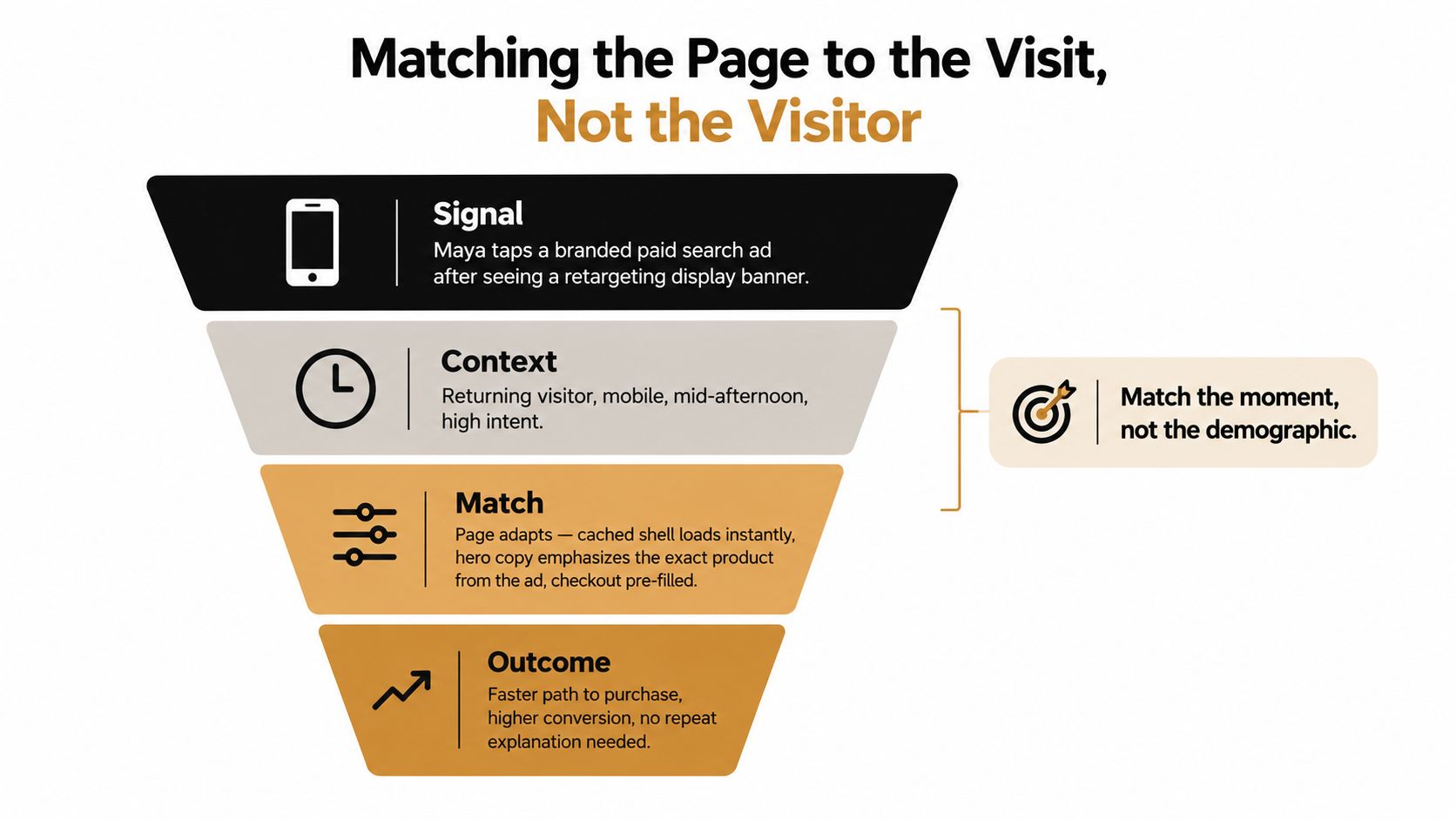
When teams do this well, the page stops asking the visitor to reinterpret the offer. It answers the reason they clicked in the first place.
Your Prioritized Optimization Roadmap
The cleanest order is almost always the least glamorous one. Fix the bottlenecks that affect every visit first, then tune layout, then tighten accessibility, then layer audience-state variants on top. If you reverse that order, you risk polishing a page that still loads too slowly and still frustrates users on mobile.
Sprint 1 foundation
Start with Largest Contentful Paint and Interaction to Next Paint. These are the metrics that tell you whether the page is usable fast enough to matter. Then move to the two or three templates that drive most of the traffic, because that's where the return shows up first.
A good roadmap reduces argument. Everyone knows what's first, what comes next, and why.
In week one, the deliverable should be a baseline audit with a short fix list, not a redesign proposal. Use Lighthouse and the Chrome User Experience report to identify the slow templates, then confirm the problems with real mobile field data. A realistic first target is LCP under 2.0 seconds on the highest-value template set, because that gives the rest of the work room to pay off.
Sprint 2 refinement
After the foundation is stable, run a focused WCAG 2.2 AA pass on forms, CTAs, and keyboard navigation. Then layer in audience-state variants only after the base experience is already healthy. That sequence matters, because personalization can amplify a weak page just as easily as it can improve a strong one.
For the accessibility audit, use axe DevTools. For behavioral validation, use Contentsquare or Hotjar to verify that users are reaching the primary action. A useful second-sprint target is mobile bounce under 45% on the revised templates, plus better form completion on the pages that matter most.
The tool stack doesn't need to be complicated. The work needs to be sequenced. If your team also evaluates copy variants, web conversion optimization is the right lens for tying message testing back to revenue rather than opinions.
A simple 30-day recap
At the end of 30 days, report the work in one frame: what got faster, what got easier to use, what got more accessible, and what changed for returning visitors. Leadership doesn't need four separate project summaries. It needs one answer to a single question, did treating optimization as one system improve the visit?
If you want that system without stitching together separate tools and workflows, Polish reads a landing page, generates headline, subheading, and CTA variants, and serves different versions based on the visitor's source, device, and return state. That makes it easier to optimize the visit instead of the page.
- optimized for web
- web performance
- core web vitals
- landing page CRO
- website accessibility
Your website rewrites itself until it converts.
Polish writes new versions of your headlines and CTAs, tests them on your real visitors and keeps the ones that win.
Start free