8 Landing Page Headline Examples That Convert
Study 8 landing page headline examples, uncover the tactics behind them, and find practical variants to test on your own pages.
Published on 16 min read
Table of contents
- 1. Value Proposition Headlines
- What to test next
- 2. Question-Based Headlines
- Let the entry point set the question
- 3. Comparison and Differentiation Headlines
- 4. Social Proof Headlines
- 5. Specific Number Headlines
- Use numbers to clarify the promise, not decorate it
- 6. Emotional Connection Headlines
- Pair aspiration with evidence
- 7. Direct Command and Action Headlines
- Adjust the command to readiness
- 8. Urgency and Scarcity Headlines
- Make urgency proportional
- 8 Landing Page Headline Types Compared
- Turn Headline Patterns Into a Testing System
One clever headline rarely converts every visitor. The person arriving from a product comparison search needs a different promise from the person clicking a brand campaign, returning after an earlier visit, or discovering your offer through a social post.
The strongest landing page headline examples align the promise with intent. They make the right trade-off between clarity and curiosity, then use proof, urgency, emotion, and action at the point where each visitor needs it. A clear outcome may work for a high-intent visitor, while a question may help an uncertain prospect name the problem. A command can suit a returning visitor, but feel too aggressive to someone seeing the brand for the first time.
This list dissects eight headline mechanisms rather than presenting universal winners. For each one, you'll see what the headline signals, why it can work, where it fails, and which variants deserve a test. The examples are starting points, not instructions to copy. Tools such as LunaBloom AI video generator may attract visitors through different creative messages, and each message creates a different expectation that the landing page should confirm immediately.
1. Value Proposition Headlines
A value proposition headline answers the visitor's first question: “What do I get from this?” It leads with an outcome, not a product description. “Build better landing pages faster” gives a visitor a reason to continue. “Advanced conversion optimization platform” mostly gives them a category label.
Examples such as Unbounce's “The #1 Landing Page Builder for Conversions,” Slack's “Where Work Happens,” and Mailchimp's “Grow Your Business with Email Marketing” show different levels of specificity. The first emphasizes category and outcome, the second uses a compact positioning statement, and the third names the desired business result.
The best version depends on the source. A paid ad about faster campaign launches should lead with speed or execution. An organic search visitor looking for conversion help may need a headline about improving landing-page performance. One headline can't express every relevant benefit equally well.
What to test next
Start with a simple structure: verb, benefit, result. Then create variants that prioritize different outcomes.
- Speed: “Launch conversion-ready pages without waiting on development.”
- Clarity: “Show every visitor why your offer fits their needs.”
- Growth: “Turn more qualified visits into meaningful actions.”
- Audience fit: “Landing page personalization for growth teams.”
Specific outcomes are useful only when you can defend them. Don't add a performance figure because it makes the line look stronger. Pair the headline with a subheading that explains how the result happens, who it's for, and what the visitor can do next.
For a deeper framework, use this guide to write a value proposition. Polish is relevant here because it can test different value propositions according to source and visitor context, rather than forcing every campaign into the same promise.
Practical rule: If a visitor can't identify the offer's primary benefit without reading the next section, the headline is still describing the product instead of selling its value.
2. Question-Based Headlines
A question mark does not make a headline engaging. A question-based headline earns attention when it matches the visitor's intent and names a problem they already recognize. “Tired of back-and-forth emails about scheduling?” fits traffic feeling that friction. “Are you struggling with writing?” qualifies the reader more gently. “How will you manage work differently?” invites visitors who are still considering a new approach.
These examples associated with Calendly, Grammarly, and Asana signal irritation, struggle, and reflection. Match the question to problem awareness. A vague prompt such as “Ready for better results?” could describe almost any offer, so it gives the visitor no clear reason to continue.
Let the entry point set the question
Continue the concern that brought the visitor to the page. An ad about reducing scheduling friction should lead to a scheduling question. An ad about team collaboration should not land on a generic productivity prompt. Close message match reduces the mental work required to understand the offer.
Use the same audience and offer for a question-versus-statement test:
- Pain-point question: “Still losing time to manual campaign updates?”
- Outcome statement: “Automate campaign updates and keep every page aligned.”
- Audience question: “Are growth teams getting the message match they need?”
- Specific question: “Does every paid click see the same landing page?”
Each variant tests a different signal. The question checks whether visitors recognize the problem. The statement sets a direct expectation. Keep the subheading as the answer. If the headline asks about wasted time, explain how the product reduces that waste and what the visitor can do next.
Tone needs testing too. “Are you making expensive mistakes?” may create anxiety before trust exists. Try a softer version for first-time visitors, then test stronger framing with returning visitors who already understand the problem. Polish can personalize the question by source and visitor context, helping teams test whether a scheduling, audience, or specific-problem prompt fits the entry signal.
3. Comparison and Differentiation Headlines
A comparison headline does not need to name a rival to change how visitors evaluate an offer. Its job is to show why this option belongs in the consideration set, usually by defining a clearer category or highlighting the attribute that affects the buying decision.
Figma's “The collaborative interface design tool,” Notion's “All-in-one workspace for notes, databases, and wikis,” and Loom's “Async video communication for the modern workplace” each signal a different reason to consider the product. Figma emphasizes collaboration, Notion breadth, and Loom asynchronous communication. The lesson is testable: match the distinction to the visitor's intent, rather than presenting a polished label that could describe any product.
This approach fits mature markets where several offers look similar. It can fail when the marketer chooses an internal talking point instead of a buyer's decision criterion. “Next-generation platform” sounds advanced but gives a visitor no practical basis for choosing.
Make the claim defensible. If the headline promises an easier, faster, or more flexible experience, the page needs evidence and a clear explanation of what that difference means. Competitor names also require legal and commercial approval, so category-based positioning may be safer.
Test one buying priority at a time:
- Workflow angle: “The workspace that keeps planning and execution together.”
- Audience angle: “Campaign personalization for lean growth teams.”
- Control angle: “Test landing page messages without rebuilding the page.”
- Integration angle: “Connect visitor context to the copy they see.”
Each variant serves a different visitor. Someone comparing tools through search may need category clarity. A visitor from a thought-leadership article may care more about control or implementation effort. Polish can personalize these angles by acquisition source and visitor profile, allowing teams to test which distinction fits the entry context.
Keep the headline focused on one difference. The subheading, product details, and proof can explain the rest. A headline that lists every advantage forces visitors to construct the positioning themselves, which weakens the comparison.
4. Social Proof Headlines
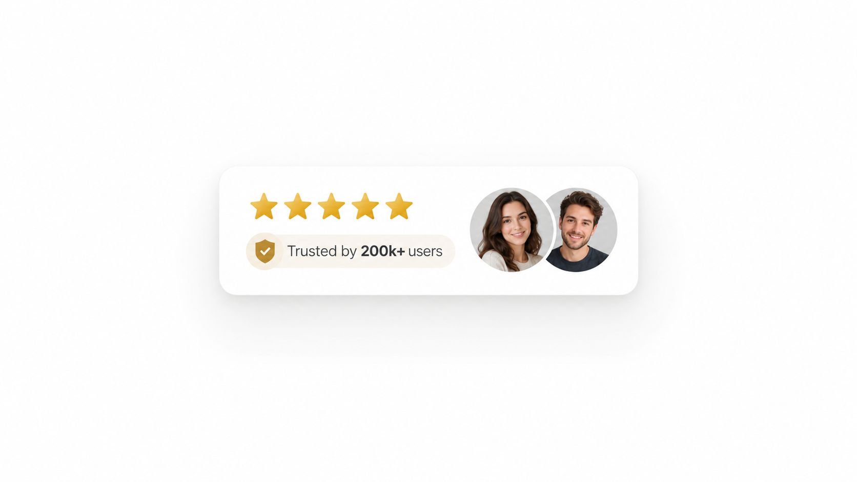
Social proof headlines reduce uncertainty by showing who uses, recommends, or validates an offer. Zendesk, Salesforce, and Dropbox use adoption, category leadership, and user scale to make credibility visible before visitors reach a testimonial or case study. The signal is immediate: the product has been chosen by others.
That signal only helps when the proof matches the visitor's concern. A broad customer base can reassure someone checking whether a product is established. A certification, peer company, or specific customer result may carry more weight for a regulated buyer or specialist team. Proof that feels distant or irrelevant becomes decoration.
Use the visitor's intent to choose the evidence:
- Establishment: “Trusted by teams building repeatable growth.”
- Peer relevance: “Used by B2B growth teams to personalize campaign entry points.”
- Outcome: “Chosen by teams improving message match across paid campaigns.”
- Risk reduction: “Trusted by teams that need controlled, reviewable personalization.”
Each variant makes a different promise. The establishment version can fail with a new or niche product if it offers no context. The peer version needs customers that closely resemble the target audience. The outcome version requires verifiable results, while the risk version needs supporting details about security, support, compliance, or implementation.
A proof headline should point to evidence, not replace it. Keep customer counts current, qualify rankings, and confirm that awards, trust marks, and customer statements are genuine. A stale claim can weaken confidence.
Test one proof angle at a time. Polish can vary the emphasis by acquisition channel and visitor profile, while the underlying evidence stays accurate. Pair the headline with relevant logos, a case study, or testimonial persuasion techniques that explain why the proof matters. Personalization changes what appears first, not what the evidence says.
5. Specific Number Headlines
Specific numbers can make a headline feel concrete, but only when the number is real, relevant, and explained. In practice, the number does one of three jobs. It signals scope, it signals change, or it signals a measurable promise. It also raises the bar for proof.
MarketingExperiments documented a PPC landing-page test in which shortening a headline from six words to four moved conversion rate from 11.3% to 21.2%, an 87.61% relative lift. The report tied the result to clarity and brevity, not to design changes. That result does not transfer automatically to every page, but it does show why a specific headline change can deserve a controlled test.
Use numbers to clarify the promise, not decorate it
A headline such as “Increase conversion rates by an average of 20%” should appear only when the business can substantiate the figure and define the conditions behind it. The same caution applies to “Grow your business with 1,200+ integrations” or “Close 40% more deals.” Those lines can work, but only when the number reflects reality and the visitor understands what it measures.
The strongest number-led headlines usually fall into four useful shapes:
- Outcome: “Improve qualified conversion rate with clearer message match.”
- Scope: “Personalize headline, subheading, proof, and CTA by visitor context.”
- Timeframe: use it only when your own evidence supports the timing.
- Process: “Test campaign-specific headlines without redesigning the page.”
Each shape points to a different visitor expectation. Outcome headlines appeal when the reader wants a result. Scope headlines work when the visitor needs to know how broad the change is. Timeframe headlines can add urgency, but they fail fast if the evidence is thin. Process headlines are safer for complex offers because they describe the method instead of overstating the payoff.
A number headline should also be judged on what happens after the click. A precise claim may attract more attention while bringing in visitors who expect something different. Check lead quality, sales progression, or another downstream measure that matches the business goal.
Use the number when it helps the visitor make a decision. Remove it when it only makes an ordinary promise look more scientific.
6. Emotional Connection Headlines
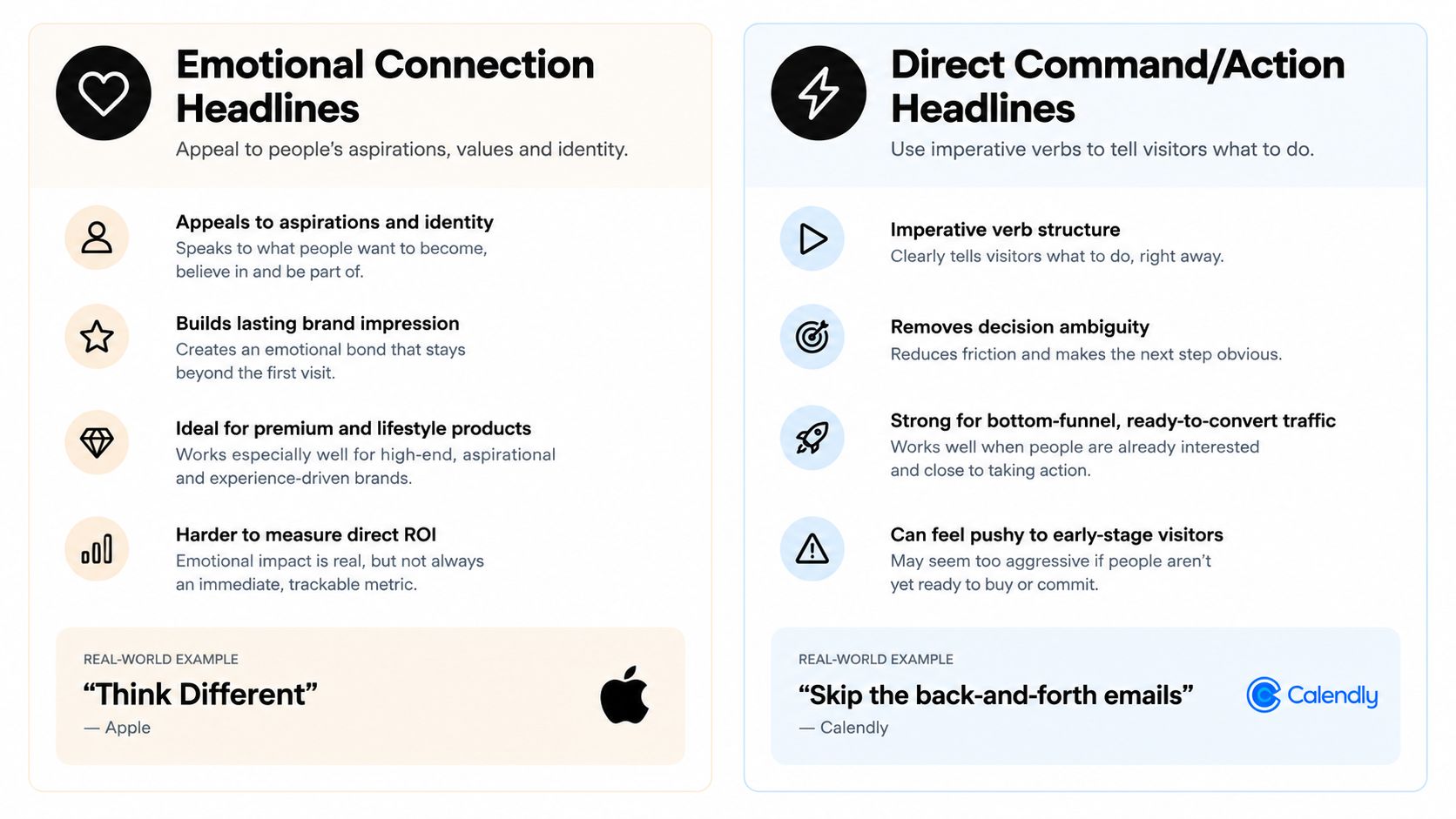
Emotional headlines appeal to identity, aspiration, relief, belonging, or confidence. Apple's “Think Different,” Nike's “Just Do It,” and Airbnb's “Belong Anywhere” are compact examples of brand-led language. They don't explain the entire product. They invite the audience to associate the offer with a desired way of seeing or living.
That makes emotional framing powerful and risky. A brand-led line can create memorability, but it may leave a first-time visitor wondering what the product does. A clear outcome usually carries more immediate information. A softer emotional headline can work when the brand is already familiar or when the page provides a concrete subheading directly underneath.
Pair aspiration with evidence
Emotional language should not float above the offer. Connect it to a practical benefit:
- Confidence: “Make every campaign entry point feel relevant.”
“Adapt the page message to the ad, audience, and visit context.” - Relief: “Stop making every visitor decode your offer.”
“Show a clearer promise based on why they arrived.” - Ambition: “Build a sharper growth experience.”
“Test the headline and CTA combinations that fit each segment.” - Belonging: “Create a page that speaks to people like them.”
“Use campaign, device, country, and visit status to shape the message.”
Emotional headlines should also match the product's actual personality. A playful line can feel wrong for a serious B2B workflow. A dramatic promise can undermine a premium brand that depends on restraint.
Use the visual treatment to reinforce the intended feeling, but don't ask design to compensate for unclear copy. The headline still needs to make the visitor's next question easy to answer.
Test aspiration against comfort, and emotion against a direct benefit. The winner isn't the line that sounds most poetic. It's the line that creates the right motivation without increasing uncertainty.
7. Direct Command and Action Headlines
A direct command tells the visitor what to do or what problem they can stop tolerating. Calendly's “Skip the back-and-forth emails,” Slack's “Get your work done in Slack,” and Typeform's “Create beautiful forms that convert more leads” use active verbs to move the reader toward an outcome.
This structure suits visitors with clear intent. Someone who has compared solutions may respond well to “Start building your personalized landing page.” Someone encountering the brand for the first time may need more context before a command feels appropriate.
The main trade-off is momentum versus pressure. “Start now” is concise but generic. “Skip the back-and-forth emails” names a frustration, but it may miss visitors whose primary concern is scheduling speed or team coordination.
Adjust the command to readiness
Use different levels of directness:
- Soft entry: “See how personalized landing pages work.”
- Low-friction action: “Explore your campaign-specific message.”
- Direct action: “Build a landing page for every campaign.”
- Problem-led command: “Stop sending every visitor to the same promise.”
The CTA and headline should not compete. If the headline says “Create your page,” a CTA such as “See the workflow” may create friction. If the headline is educational, a softer CTA can preserve the visitor's current intent.
Polish can help test “Start,” “Try,” and “Get started” language against different visitor stages. It can also vary command strength by source and returning status. Keep the action easy to understand, and don't imply instant completion if the visitor must complete a long form or book a sales call.
For more starting points, use this CTA generator, then evaluate the result alongside the headline. A strong command doesn't rescue a weak promise. It makes a clear promise easier to act on.
8. Urgency and Scarcity Headlines
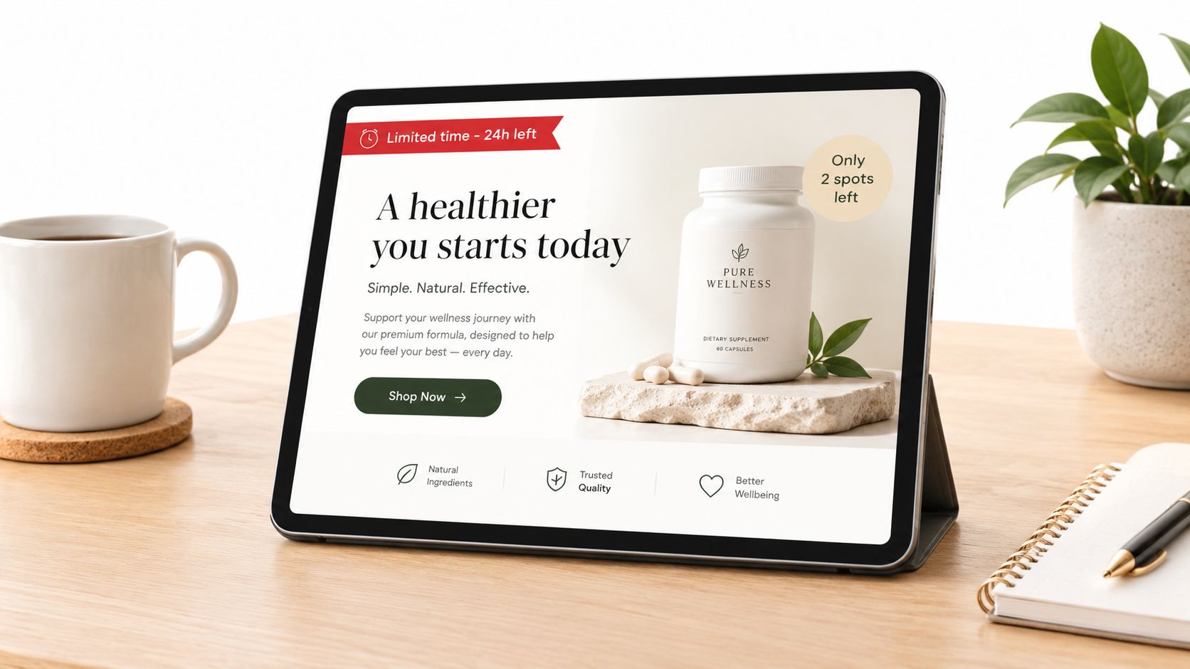
Urgency headlines make the cost of waiting visible. Scarcity headlines make availability visible. Booking.com's “Only 2 rooms left at this price,” Udemy's “24-hour flash sale, 99% off select courses,” and Amazon Prime's free-trial framing show how urgency can be tied to price, time, or access.
These examples also show why truth matters. A countdown for a permanent offer trains visitors to distrust the page. A scarcity claim that resets after every visit is not persuasive strategy. It's manipulation, and it can create short-term action at the expense of brand confidence.
Urgency works best when a real deadline, limited cohort, seasonal offer, or changing inventory gives the visitor a legitimate reason to decide now. For an evergreen SaaS feature, use immediacy through relevance rather than pretending the feature will disappear.
Make urgency proportional
Test the trigger, not just the intensity:
- Deadline: “Apply before this campaign intake closes.”
- Availability: “Join the next limited implementation group.”
- Offer: “Get the campaign review with your onboarding.”
- Decision cost: “See your message match before your next launch.”
Match urgency to visitor context. A first-time visitor may need a clear value proposition before a deadline. A returning visitor who has already viewed the offer may respond to a direct reminder. Paid traffic can arrive with stronger expectations, but it still needs a truthful claim.
Support the urgency with precise terms in the subheading. State what ends, when it ends, and what the visitor receives. If the condition changes by country, device, or campaign, make that logic transparent to the team managing the page.
A useful test compares urgency with no urgency while holding the offer constant. If urgency increases conversion but lowers lead quality or creates complaints, it isn't improving the system. It may only be pushing the wrong people faster.
8 Landing Page Headline Types Compared
| Headline Type | 🔄 Implementation Complexity | 💡 Resource Requirements | ⭐📊 Expected Outcomes | Ideal Use Cases | ⚡ Key Advantages |
|---|---|---|---|---|---|
| Value Proposition Headlines | Medium, audience research + clear copy | Moderate, analytics, copywriting, A/B testing (Polish) | ⭐ High conversion lift, 📊 measurable benefit focus | Conversion-focused landing pages, segmented traffic | Quickly communicates core value, easy to iterate with tests |
| Question-Based Headlines | Low–Medium, craft relevant, answerable questions | Low, copywriting + segment insights | ⭐ Medium engagement, 📊 increases dwell/time on page | Awareness and engagement pages, content-led flows | Sparks curiosity and engagement; simple to personalize |
| Comparison & Differentiation Headlines | High, requires competitive intel and defensible claims | High, market research, legal review, testing | ⭐ High for consideration-stage, 📊 clarifies choice vs alternatives | Mature markets, comparison pages, feature-focused buyers | Clears buying rationale, addresses objections up front |
| Social Proof Headlines | Low, compile verifiable proof and badges | Moderate, collect testimonials, update metrics regularly | ⭐ High credibility boost, 📊 reduces trust friction for new users | B2B/SaaS homepages, free-trial signups, first-time visitors | Builds trust fast; effective when personalized by segment |
| Specific Number Headlines | Medium, verify data and craft precise claims | Moderate, analytics, case studies, periodic updates | ⭐ High memorability & attention, 📊 measurable performance lifts | Performance-focused landing pages, case studies, ads | Specificity increases credibility; strong for A/B testing |
| Emotional Connection Headlines | High, needs brand alignment and authentic storytelling | High, brand strategy, creative assets, imagery | ⭐ High long-term brand affinity, 📊 weaker short-term ROI | Lifestyle, premium products, brand campaigns | Drives loyalty and sharing; supports premium positioning |
| Direct Command / Action Headlines | Low, straightforward imperative copy | Low, basic copy + testing | ⭐ High for bottom-funnel, 📊 increases immediate conversions | Bottom-funnel pages, returning visitors, PPC landing pages | Removes ambiguity and reduces friction for ready buyers |
| Urgency & Scarcity Headlines | Low–Medium, timing + truthful claims required | Moderate, inventory/time management, legal compliance | ⭐ High CTR and fast conversions, 📊 risk of low-quality leads if overused | Flash sales, limited offers, event registrations | Drives immediate action; powerful when used sparingly and honestly |
Turn Headline Patterns Into a Testing System
The eight mechanisms are not a ranking. They're a selection system. Start with visitor intent, then choose the headline structure that resolves the visitor's main uncertainty.
Use a value proposition headline when the visitor needs to understand the benefit. Use a question when the visitor is problem-aware but still exploring. Use differentiation when the category feels crowded. Use social proof when trust is the primary barrier. Use a specific number when verified evidence makes the decision clearer. Use emotional language when identity or aspiration matters. Use a command when the visitor is ready to act. Use urgency only when a real reason to act now exists.
The headline can't carry the entire argument. Its subheading should resolve the promise in practical language. If the headline says “Make every campaign entry point feel relevant,” the subheading can explain that the page adapts its headline, proof, and CTA to the visitor's source and context. If the headline uses proof, the next line should clarify what the proof demonstrates. If it uses urgency, the page should state the exact condition behind the deadline or limited availability.
Verify every claim before it reaches production. Customer counts, rankings, certifications, performance outcomes, deadlines, and scarcity statements all need an owner and a review process. A headline that sounds more credible than the evidence behind it creates conversion friction later, particularly when prospects involve procurement, legal, or sales teams.
Testing also requires meaningful variants. Don't spend the entire test budget changing one adjective while the underlying promise stays identical. Compare a value-led headline against a segment-specific alternative, or a question against a direct statement. Controlled tests have demonstrated why headline changes deserve attention. One widely cited MarketingExperiments analysis reported a 72.76% increase in conversion rate after changing only the site headline while keeping the body copy constant, as described in its site headline test. That historical result isn't a forecast for your page. It is a reminder that the headline can influence the outcome without a complete redesign.
Attention is concentrated at the top of the page. An industry summary cites research that 80% of visitors read only the headline and first sentence of the subhead before deciding whether to continue or leave, as discussed in this landing-page headline testing summary. Benchmark context also varies substantially by industry. Unbounce's Q4 2024 benchmark reported a 6.6% median landing-page conversion rate, with medians ranging from 3.8% in SaaS to 12.3% in entertainment in its conversion benchmark report. Those figures aren't targets for every page. They show why message fit and audience context matter when evaluating a headline.
Create a simple testing brief for each variant:
- Audience: Who sees this version?
- Source: Which ad, post, search query, or referral brought them?
- Intent: Are they discovering, comparing, validating, or ready to act?
- Promise: What outcome does the headline make visible?
- Support: Which subheading, proof, and CTA validate it?
- Guardrail: Which downstream metric prevents a misleading win?
Then use sample sizing for A/B tests to plan the experiment before reading early results. Polish can be one relevant option for adapting the page to the ad, post, or search that brought someone in, as well as their campaign, device, country, and returning-visitor status. Start with one strong value proposition and one segment-specific alternative. Let evidence determine whether the next test should change the mechanism, the audience promise, or the supporting proof.
The practical goal isn't to find a headline that wins forever. It's to build a page that makes a relevant promise to the right visitor, proves that promise quickly, and learns from every credible test.
Polish writes a landing page for each visitor, including the headline, subheading, proof, CTA, and section order, based on the context that brought them there. Use Polish to test more relevant headline variants by source, campaign, device, country, and returning-visitor status.
- landing page headline examples
- headline formulas
- conversion copywriting
- landing page optimization
- A/B testing
Your website rewrites itself until it converts.
Polish writes new versions of your headlines and CTAs, tests them on your real visitors and keeps the ones that win.
Start free