Hero Landing Page: What It Is and How to Build It
Learn what a hero landing page section is, how to design it for conversions, and the measurement strategies behind high-performing pages.
Published on 13 min read
Table of contents
- What the Hero Landing Page Actually Is
- The storefront-window test
- The Anatomy of High-Converting Hero Sections
- Four parts, four jobs
- Writing Hero Copy That Forces a Decision
- A practical copy formula
- Cut words that don't change the meaning
- Run a five-minute hero audit
- Static Versus Adaptive Hero Design Strategies
- The audience changes the baseline
- Personalization needs operating rules
- Measuring Hero Performance with Segmented Data
- Build the diagnostic view
- Use controls and meaningful outcomes
- Avoiding the Personalization Trap
- Start with the smallest useful decision
A hero landing page is the visually dominant top section of a conversion-focused page, built to capture attention and drive one primary action. The clearest starting benchmark is a 6.6% median conversion rate across more than 41,000 landing pages, but the hero only works when its message matches the visitor, device, traffic source, and offer.
You've paid for the click. The visitor arrives from an ad, email, or search result, sees a crowded screen, and tries to answer a simple question: “Am I in the right place?” If the headline is vague, the supporting copy hides the benefit, or the button asks for too much commitment, the visitor leaves before the rest of the page gets a chance.
That makes the hero more than a polished banner. It's the first decision point in the funnel, and the strongest teams treat it as a measurable system. They define the audience context, control the message, test meaningful variations, and protect speed, accessibility, and trust while they optimize.
What the Hero Landing Page Actually Is
A visitor clicks an ad promising “automated reporting for growing teams.” The page opens with a large photograph, a headline that says “Work smarter,” three competing buttons, and a paragraph about the company's history. The visitor can't tell whether the product solves reporting, project management, or something else. They leave.
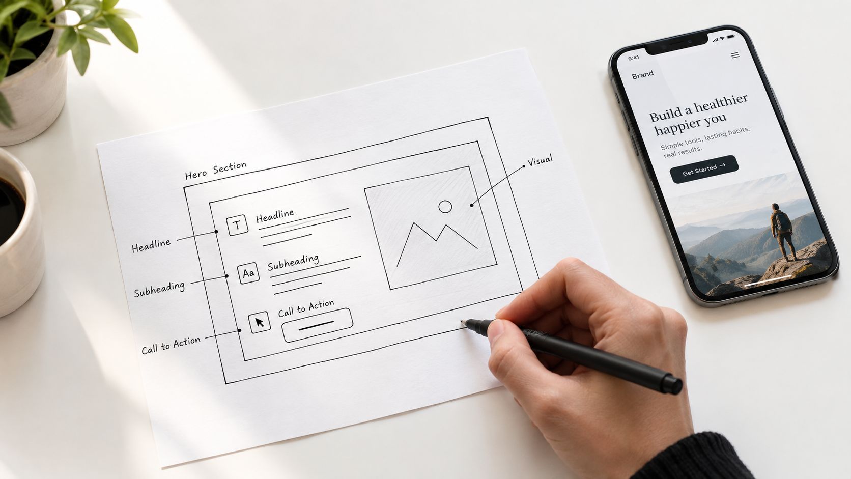
That first screen is the hero landing page, the visually dominant area a visitor sees before scrolling. It usually combines a headline, supporting subheading, visual treatment, and primary call to action. Its job isn't to explain everything. Its job is to make the offer understandable enough that the right visitor knows what to do next.
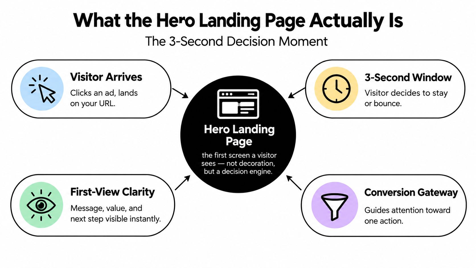
Think of the hero as a digital handshake between the visitor's intent and your offer. A person searching for payroll software expects payroll language. Someone arriving from a security campaign expects evidence about controls and risk. The visual design supports that exchange, but the message carries it.
The storefront-window test
A storefront window has limited time to communicate what the shop sells, who it serves, and why someone should enter. A hero has the same constraint. It should answer four questions without requiring a deep read:
- What is this? Name the product, service, or category.
- Who is it for? Signal the relevant audience or situation.
- Why should I care? State the strongest customer benefit.
- What should I do next? Present one clear action.
A hero can sit on a standalone campaign page or at the top of a broader website. The distinction matters because campaign traffic usually carries a specific promise from an ad or email, while homepage traffic may arrive with less defined intent. For a concise explanation of the related homepage pattern, you can browse the web design glossary by Raze.
Your page's first screen doesn't need to contain every proof point, feature, or objection handler. It needs to establish message match and reduce uncertainty. A visitor who understands the offer can scroll, click, or submit. A visitor who has to decode the page won't reward an attractive layout.
For a broader foundation on how landing pages differ from other website pages, see this guide to landing pages explained.
The Anatomy of High-Converting Hero Sections
A visitor arrives from an ad, email, or search result and gives the first screen a quick test: does this page match the expected promise, and is the next step clear? A high-performing hero answers through a deliberate sequence. The headline earns attention, the subheading adds meaning, the visual gives the offer context, and the call to action turns understanding into action. Treat those elements as a measurable experiment, not a collage of design choices.
Four parts, four jobs
The headline states the primary promise. “Powerful workflow automation” sounds polished but gives the reader little to use. “Automate weekly client reports without rebuilding your spreadsheets” identifies both an outcome and a problem. For layout and hierarchy principles, see our guide to above-the-fold design.
The subheading adds the mechanism or boundary. It can explain who the product serves, how it works, or what happens after the click. “Connect your data sources, choose a report template, and send branded updates from one workspace” makes the headline more credible by showing what the product does.
The visual should reinforce the claim. A product screenshot suits software when the interface is easy to understand. A real person, environment, or product image may work better when the decision depends on trust, emotion, or imagining an experience. Decorative imagery that competes with the headline creates attention without direction.
The CTA names the next step in language that matches the commitment. “Get a customized demo” sets a different expectation from “Start free.” Neither is automatically correct. The button should tell visitors what will happen after the click.
A weak pairing might read:
“Transform your business.”
“Our platform helps organizations achieve more.”
“Learn more.”
A clearer version might read:
“Turn campaign data into a report your client can use today.”
“Connect ad, CRM, and revenue data in one workspace, then share a ready-to-review summary.”
“See a sample report.”
The second version narrows the promise, explains the product's role, and makes the next step tangible. For more implementation ideas, review these landing page optimization tips.
Reading level affects comprehension. A benchmark covering more than 41,000 landing pages found that pages written at a fifth-to-seventh-grade reading level had an 11.1% median conversion rate, compared with 5.3% for pages written at a college reading level, as reported by MarketingProfs' landing-page conversion benchmarks. The practical lesson is not to make every brand sound childish. Visitors should understand the value without translating dense language.
The hero also needs a performance budget. Large images, autoplay video, and late personalization can delay the message. Google research summarized by Kissmetrics' landing-page conversion guide reports that raising load time from one to three seconds increases bounce probability by 32%, while raising it from one to five seconds increases it by 90%. Render the core headline, subheading, and CTA early, reserve space for media, and defer scripts that do not support the first decision.
Writing Hero Copy That Forces a Decision
A growth manager arrives from a paid campaign and has only a few seconds to decide whether the page matches the promised outcome. If the hero says, “We're a modern platform built for teams,” the visitor learns what the company thinks about itself, not what will change after clicking.
Start with the visitor's job. Identify what they want to accomplish, avoid, or understand. Then build the headline around that outcome instead of an internal feature name. The hero should work like a signpost: it helps a specific visitor recognize the right route before they spend attention on the rest of the page.
A practical copy formula
Use this structure:
Outcome + audience or situation + useful distinction
Examples:
- “Create compliant reports without chasing evidence across spreadsheets.”
- “Book more qualified consultations from the traffic you already pay for.”
- “Plan product launches with one shared view of every dependency.”
Each headline connects a desired result with a recognizable context. It makes one relevant promise clearly, rather than trying to represent the entire product.
The subheading answers the next question, “How?” A useful pattern is:
Mechanism + scope + reduced friction
For example: “Pull data from your ad platforms and CRM, apply a repeatable template, and send client-ready summaries without manual copying.” The headline states the destination. The subheading shows the route and removes a practical concern.
Cut words that don't change the meaning
Temporarily remove each phrase and reread the sentence. If the offer means the same thing, the phrase probably does not belong in the hero. “Powerful insights,” “integrated solutions,” and “next-generation technology” add tone without identifying an outcome, audience, or mechanism.
Compare these versions:
| Weak version | Clearer version |
|---|---|
| “Improve your marketing performance” | “Find the campaigns that generate qualified pipeline” |
| “A smarter way to collaborate” | “Keep launch tasks, owners, and deadlines in one workspace” |
| “Get started today” | “Build your first campaign report” |
The clearer CTA names the visitor's immediate next step. These call to action examples for 2025 offer additional patterns, but adapt the wording to your offer and audience. Treat the examples as hypotheses for testing, not fixed formulas.
Urgency and pressure are different. A CTA can create momentum by reducing uncertainty, with wording such as “See the workflow” or “Compare your options.” Artificial scarcity is unnecessary. Match the button to the funnel stage and keep one primary action visible so the experiment has a clear decision point.
Run a five-minute hero audit
Ask a colleague who has not seen the page to read only the hero. Then ask:
- What does the company offer?
- Who is it for?
- What benefit did you notice?
- What would happen if you clicked the button?
- What question remains unanswered?
If the answers differ from the intended message, revise the copy before redesigning the layout. A value proposition writing guide can help translate product language into customer language. Record the audience segment and traffic context alongside each copy version, so later performance results can be interpreted rather than averaged into a misleading overall number.
Static Versus Adaptive Hero Design Strategies
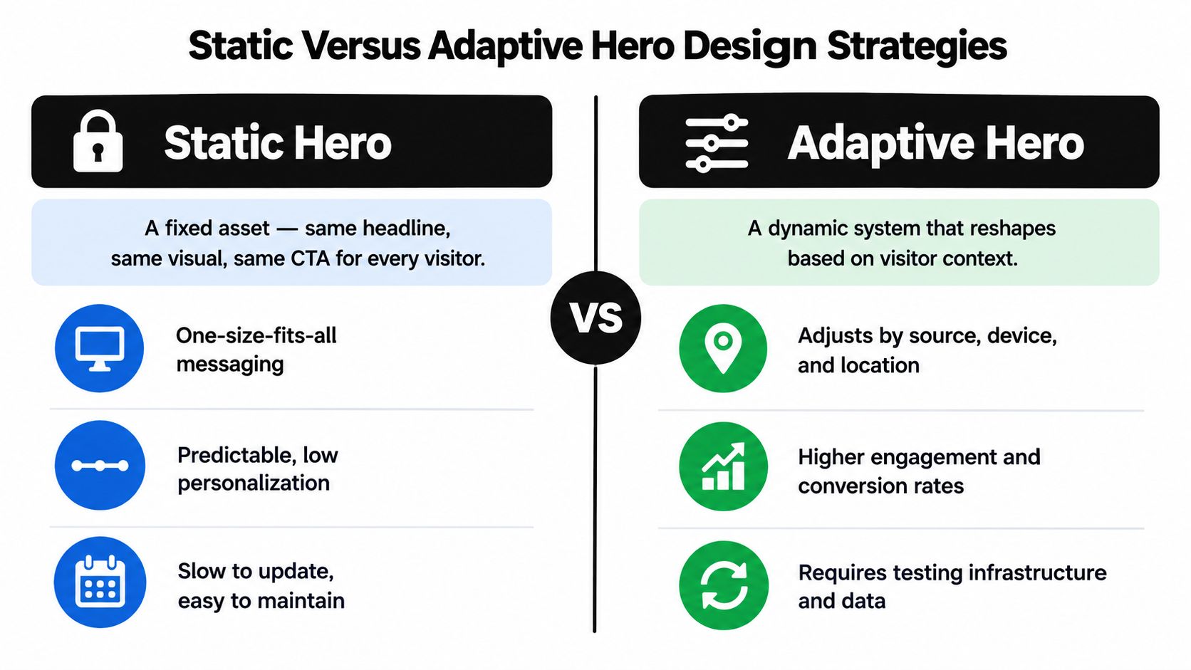
A visitor arrives from a paid search ad, an email, or a previous visit. Each source creates a different starting point, yet a static hero gives all three visitors the same headline, subheading, visual, and CTA. That consistency simplifies maintenance and protects the brand, but it can leave the message misaligned with the visitor's immediate question.
An adaptive hero treats those elements as controlled variables in a personalization experiment. The product stays the same while the emphasis changes with context. An email visitor might see a direct action, a paid-search visitor might receive clearer category language, and a returning visitor might see a more familiar next step.
The audience changes the baseline
Benchmark results show why context matters. Across industries, the median landing-page conversion rate was 6.6%. Financial-services pages recorded 8.4%, while SaaS pages recorded 3.8%, according to MarketingProfs' benchmark analysis, as noted earlier. These figures are reference points, not targets to copy. A universal benchmark can hide meaningful differences in intent, offer, and audience quality.
Traffic source changes the visitor's starting level of trust. Email visitors converted at an average rate of 19.3% in the same benchmark, while 82.9% of landing-page visits came from mobile devices. Someone arriving through a trusted email may need a direct action. Someone arriving through a cold paid-search query may first need category clarity and proof.
A static hero might say:
“Analytics for modern marketing teams”
An adaptive version can preserve that category while sharpening the emphasis:
- Paid search: “See which campaigns create qualified pipeline.”
- Email: “Turn your campaign data into a report your team can share.”
- Returning visitor: “Pick up where your marketing analysis left off.”
The promise remains stable. The route into that promise becomes more relevant.
Personalization needs operating rules
A separate message for every possible segment creates a measurement problem. Variants divide traffic, increase approval work, and make it difficult to tell whether a result came from the message or from the audience assigned to it.
Google's landing-page optimization playbook recommends relevant messaging and personalization based on funnel stage, demographics, and interests. Its practical use is to map dependable signals, such as campaign, search intent, device, country, and visit status, to a limited set of controlled variants. The Google landing-page optimization playbook also supports keeping a persistent control and checking downstream quality rather than clicks alone.
Start with signals the site can identify confidently, such as campaign promise or broad intent. Keep a default hero for unknown visitors. Document the rule behind every variant, its primary objective, and the audience it serves. Adaptive design should sharpen learning while preserving enough consistency for a growth team to govern the experiment and interpret its results.
Measuring Hero Performance with Segmented Data
A site-wide conversion rate can tell you that something happened. It can't tell you whether the hero caused it, whether one audience carried the result, or whether another audience abandoned the page before the message appeared.
Measurement starts with the visitor context. Record the acquisition source, campaign or ad group, device, geography, visitor status, served hero variant, and primary conversion. Then compare the adaptive experience with a stable control instead of comparing unrelated periods.
Build the diagnostic view
A useful reporting structure looks like this:
| Dimension | Question to ask |
|---|---|
| Acquisition source | Does the hero continue the promise made in the ad, email, or referral? |
| Device | Does the message appear quickly and remain usable on a small screen? |
| Geography | Do translation, local expectations, or regulatory constraints change comprehension? |
| Industry or use case | Does the headline emphasize the problem this audience actually needs solved? |
| Visitor status | Does a returning visitor need orientation, proof, or a more direct action? |
The benchmark's device figures illustrate why this matters. Desktop visitors converted at 12.1%, compared with 11.2% for mobile visitors, while mobile accounted for 82.9% of landing-page visits in the reported dataset. Those numbers don't prove that a particular hero caused the gap, but they show why a desktop average can hide a mobile problem.
Reading level belongs in the same diagnostic view. The relationship between simpler copy and higher median conversion in the benchmark suggests that teams should inspect comprehension, not only visual hierarchy. If a mobile visitor sees a long sentence, a delayed image, and a small CTA, the problem may be message delivery rather than persuasion.
Use controls and meaningful outcomes
A controlled experiment assigns visitors to a default hero or an alternative, then measures a predefined outcome. Choose one primary outcome for the page, such as lead submission, qualified lead rate, or completed purchase. CTA clicks can help diagnose the path, but a more compelling button that attracts low-intent submissions isn't a business win.
Keep the control running while the adaptive experience operates. Log the variant and segment at exposure, then join that record to the conversion and downstream quality event. If returning visitors see several experiences, account for repeated exposure rather than treating every session as fully independent.
Google Ads landing-page reporting can connect landing-page behavior with clicks, cost, and conversion rate, which helps the team evaluate speed and message together. A useful review asks:
- Did the variant improve the primary conversion?
- Did lead or customer quality hold steady?
- Did performance differ by campaign or device?
- Did the page load before the personalized message appeared?
- Did the variant introduce accessibility or layout issues?
This approach turns hero optimization into diagnosis. You're not asking whether a headline “feels better.” You're asking where, for whom, and under what conditions it helps.
Avoiding the Personalization Trap
More personalization isn't automatically better. If you change the hero for every micro-segment, you can fragment learning, weaken brand consistency, and wait too long for a reliable result. A smaller set of well-supported variants often teaches the team more than a large library of clever guesses.
Mobile performance makes the trade-off sharper. Mobile website conversion rates reportedly declined 6.1% in 2025, while mobile bounce rates rose 54% across the year, according to SQ Magazine's web design statistics. Relevance and speed are therefore connected. A personalized message that arrives late, shifts the layout, or renders badly on a small screen can reduce the value of the personalization itself.
Start with the smallest useful decision
Use a hierarchy that protects learning:
- Match the campaign promise. If the visitor clicked an ad about invoice automation, keep the hero about invoice automation.
- Add broad intent. Separate visitors looking for a product overview from those seeking pricing, security, or a specific use case.
- Adapt the action framing. Keep the destination and conversion goal stable while changing “See the workflow” to “Book a demo” when the context supports it.
- Test finer segments only after the broad version works. A role or industry variant needs a clear message difference and enough traffic to evaluate.
- Keep a default. When the signal is missing, conflicting, or uncertain, show the approved control hero.
Your governance document should define approved claims, allowed signals, variant owners, fallback rules, and the primary metric. It should also require checks for text expansion, keyboard navigation, visible focus states, contrast, screen-reader structure, reduced motion, translation, and Core Web Vitals. Web Almanac reporting found that the median Lighthouse Accessibility score improved only 1% in 2025, reaching above 85%, while other reporting citing Web Almanac data placed sites passing Core Web Vitals at 48% on mobile and 56% on desktop in 2025, as summarized by Web Almanac's accessibility report. Accessibility and performance aren't decorative refinements. They determine whether visitors can receive and act on the message.
Practical rule: Personalize only when the signal is reliable, the copy difference is meaningful, and the result can be measured without sacrificing the default experience.
The final decision is simple. Ask which single change could make the hero more relevant for a substantial audience without changing the product promise. Test that change against a persistent control, inspect quality by segment, and keep the variant only when it improves the intended outcome without creating speed, accessibility, or trust problems.
Polish offers an autonomous way to create and test landing-page hero variations, including headlines, subheadings, and CTAs, then serve versions based on context such as campaign, device, country, or visit status. If you want to evaluate adaptive hero copy without building every rule manually, visit Polish and review how it could fit your experimentation process.
- hero landing page
- landing page design
- conversion optimization
- CRO
- A/B testing
Your website rewrites itself until it converts.
Polish writes new versions of your headlines and CTAs, tests them on your real visitors and keeps the ones that win.
Start free