CTA Optimization: A Growth-Focused Action Guide
Master CTA optimization with proven copy frameworks, placement strategies, and A/B testing methods that drive real conversions.
Published on 14 min read

Table of contents
- Why Most CTA Tests Fail Before They Start
- Reduce choice before changing design
- Attention isn't conversion
- The Five Pillars of Effective CTA Design
- Copy should describe the next value
- Placement should follow the decision
- Design earns attention
- Context makes relevance possible
- Timing controls commitment
- Setting Up CTA Experiments That Actually Work
- Plan traffic around the effect you need
- Protect the interpretation
- Personalization Without Losing Trust
- Start with signals visitors can understand
- Don't impose one global rule
- Choosing Your CTA Strategy by Business Context
- Ecommerce should test friction deliberately
- B2B needs a sequence, not one demand
- Measure quality across the journey
- Your 30-Day CTA Optimization Action Plan
- Days one through seven, audit the decision
- Days eight through fourteen, choose one test
- Days fifteen through twenty-four, run cleanly
- Days twenty-five through thirty, decide and document
The highest-converting CTA isn't always the most persuasive one. Sometimes, it wins because the page stops asking visitors to choose between competing next steps. An analysis of 18,639 landing pages found that pages with one CTA link had an average conversion rate of 13.5%, compared with 10.5% for pages containing more than five links, a difference of three percentage points in that dataset (landing page conversion benchmarks).
That doesn't make “use one button everywhere” a serious strategy. It means your primary action needs a clear hierarchy, a relevant promise, and a measurement plan that reaches beyond the click. Personalization makes the problem harder, because a more relevant CTA can improve the experience while an overly familiar one can make visitors question how much you know about them.
Why Most CTA Tests Fail Before They Start
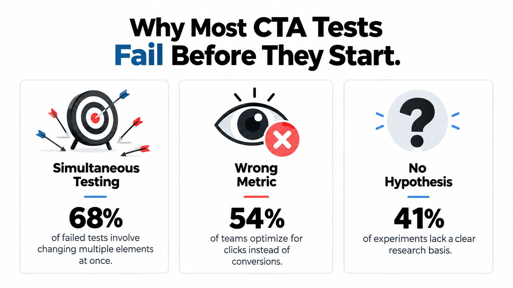
CTA optimization is often treated as a visual design exercise. Teams debate button colors, corner radii, icon placement, and whether “Get started” sounds better than “Start now.” Those details can matter, but they rarely rescue a page that asks visitors to make several competing decisions or promotes an action that doesn't match their intent.
The first decision is strategic: what should this visitor do next? A product landing page might prioritize a purchase, a demo request, or a trial activation. A comparison page might need to move a visitor to pricing. A first-touch article may be better served by a lower-commitment action. Without one defined primary conversion event, a test can produce a prettier page without producing a better business outcome.
Reduce choice before changing design
The landing-page benchmark above found an average conversion rate of 13.5% for pages with a single CTA link, 11.9% for pages with two to four CTA links, and 10.5% for pages with more than five links (the underlying landing-page analysis). Treat those figures as an aggregate starting point, not a universal causal rule. Traffic source, offer complexity, industry, and visitor readiness can change the result.
The practical lesson is sharper than “remove buttons.” Keep documentation, comparison, and secondary education available when visitors need them, but don't give those options equal visual weight when the page's commercial goal is clear. A repeated primary CTA can work on a long page if it points to the same next step. Five unrelated actions create a different problem.
Practical rule: Give every page one unmistakable primary action. Let secondary actions support the decision, not compete with it.
Attention isn't conversion
A CTA that attracts the eye has cleared only the first hurdle. A 2014 eye-tracking study involving 62 participants found that relatively subtle changes to CTA design and placement could affect where attention concentrated, but the report distinguished attention from clicking and purchasing (Econsultancy's eye-tracking discussion). A visitor can notice a button and still reject its offer, distrust its promise, or abandon the form that follows.
That distinction changes how you write a hypothesis. “The blue button will stand out more” is a design observation. “Visitors arriving from this campaign will understand the offer faster when the CTA names the result they receive” is a testable proposition. Define the event, isolate the variable, and use a pre-declared minimum detectable effect rather than treating every visible movement as a win. A useful explanation of that planning discipline is available in this guide to minimum detectable effect.
The Five Pillars of Effective CTA Design
A strong CTA sits at the intersection of copy, placement, design, context, and timing. These aren't interchangeable levers. Better contrast can't repair a vague promise, and sharper copy can't help if the button appears before the visitor understands the offer.
Copy should describe the next value
Write the label around what the visitor receives or accomplishes, not only the effort they must make. “Submit” describes an internal process. “See my results” describes a reason to continue. The right wording depends on the page promise and visitor intent, so universal rules about first-person language or a fixed word count are weak starting points.
Test one mechanism at a time. You might compare an explicit outcome with a risk-reducing phrase, or an effort-disclosing label with a benefit-led label. Preserve the offer while changing the framing. A higher click rate isn't useful if the new wording attracts people who don't want the next step.
Placement should follow the decision
An above-the-fold CTA makes sense when the visitor arrives with strong intent and already understands the offer. It can be premature on an educational page, a complex service page, or a high-consideration purchase. Place the action where the visitor has enough evidence to make the decision, then test whether a repeated version helps people who reach that point later.
Design earns attention
Contrast, whitespace, size, and interaction states determine whether visitors can identify the action. They don't determine whether the action deserves a click. Fix accessibility and affordance problems first, then avoid spending the testing budget on decorative changes while the promise remains unclear.
Context makes relevance possible
Campaign source, search intent, device, country, and return-visit status can all change what a visitor is ready to do. Someone arriving from a comparison ad may respond to “Compare plans,” while someone returning to a pricing page may be ready for “Choose a plan.” Contextual adaptation doesn't require sensitive personal data, which matters when relevance and trust pull in opposite directions.
Timing controls commitment
A first visit often calls for a lower-commitment next step, while a returning visitor may be ready for a direct commercial action. That doesn't mean hiding the main offer. It means matching the ask to the evidence the visitor has already consumed and the friction they're likely to accept.
| Testing priority | Expected impact | Implementation complexity | Best for |
|---|---|---|---|
| CTA message and value framing | Often high when the offer is unclear | Low | Pages with strong traffic but weak intent matching |
| Placement at a decision point | Variable, depending on page length and visitor readiness | Low to medium | Long-form landing pages and content-led funnels |
| Contextual CTA variant | Potentially meaningful when audiences have distinct needs | Medium | Campaigns with clear source or journey differences |
| Visual hierarchy and interaction state | Useful for visibility and usability issues | Low to medium | Pages where visitors overlook or misread the action |
| Commitment level and timing | Valuable for multi-stage journeys | Medium to high | SaaS, B2B, ecommerce, and considered purchases |
The priority order isn't a universal ranking of impact. It reflects what teams can usually isolate and learn from most cleanly. Don't test a shadow treatment when visitors still don't know what happens after the click.
Setting Up CTA Experiments That Actually Work
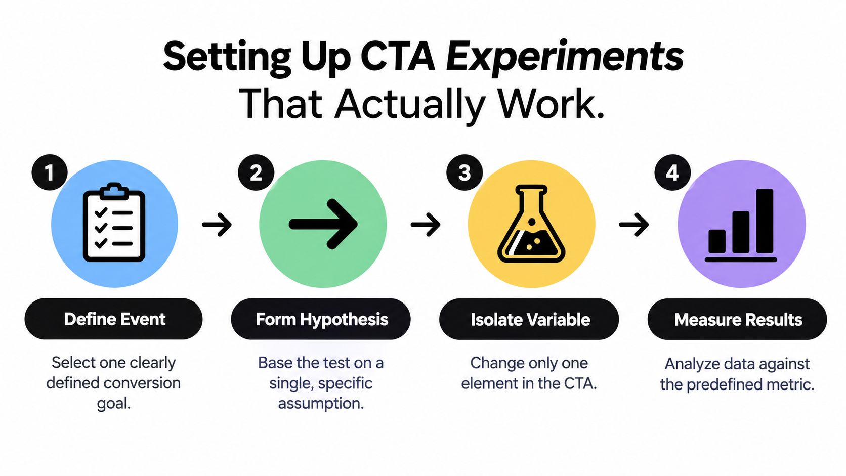
A CTA experiment is only as useful as the decision it supports. Before creating a variant, define one primary conversion event, one hypothesis, and the baseline, minimum detectable effect, significance level, and statistical power. If the team cannot explain what would qualify as a meaningful business improvement, the test is not ready for interpretation.
Use this workflow:
- Define the event. Choose a completed action, such as a qualified lead, activated trial, purchase, or revenue event. Treat the click as a diagnostic measure, not the final objective.
- Form one hypothesis. Name the audience, change, expected mechanism, and outcome. “Changing the button from a generic command to an explicit result will improve qualified form completion for paid search visitors” gives the team a testable claim.
- Isolate the variable. Change the wording, destination, placement, or interaction state. Combine variables only when the traffic volume and design support a multivariate experiment.
- Split traffic randomly. Keep allocation equal between control and variant. Exclude bots and internal traffic, remove duplicate sessions, and record campaign changes that could affect the sample.
- Set the stopping rule in advance. A variant that looks promising in an early read has not necessarily produced a reliable result.
- Measure the full journey. Track the click, completed form, qualification, purchase or pipeline, and quality signals that show whether the conversion was valuable.
Plan traffic around the effect you need
For a 5% baseline conversion rate, detecting a 20% relative lift, from 5% to 6%, at approximately 95% confidence requires about 3,700 visitors per variation, or 7,400 total (CTA A/B testing methodology). Smaller samples can produce unstable winners, especially when the meaningful business outcome happens after the click.
A 5% alpha represents a nominal 5% false-positive risk for one properly specified test. Running 20 independent tests without adjusting the significance threshold can raise the chance of at least one false positive to roughly 64%. Limit the number of questions asked in one experiment and document which outcome was primary.
Teams planning a landing page comparison can review this guide to structuring landing page split tests alongside this A/B test guide for agencies. Both support the same operating discipline: decide what the comparison must prove before incoming data changes the team's confidence.
Protect the interpretation
Segmentation can reveal useful follow-up questions, but it can also create false winners. Run the primary analysis first, then examine segments as hypothesis sources. A CTA that appears stronger for one campaign may have benefited from a different visitor mix, message, or level of intent.
Privacy adds another interpretation risk. Avoid using personal signals that visitors would not reasonably expect to create a more relevant CTA. Context such as campaign source or the page being viewed can support useful adaptation, while unexplained targeting can reduce trust even if the click rate improves.
Use guardrails with the primary outcome:
- Lead quality: Check whether the CTA attracts people sales can qualify.
- Funnel completion: Compare form starts with completed submissions, not only button clicks.
- Commercial value: Track purchase, qualified pipeline, or revenue where the journey supports it.
- Customer quality: Monitor cancellation, refund, activation, or retention signals when available.
A test can lose on clicks and win on qualified revenue. It can also win on clicks while weakening the funnel. The measurement plan needs to expose both outcomes.
Personalization Without Losing Trust
Personalization is often presented as an automatic conversion advantage. The evidence points to a more difficult trade-off. 64% of global consumers prefer companies that tailor experiences to their needs, while only 33% trust companies to use personal information responsibly (consumer privacy and personalization research).
That gap changes the question marketers should ask. It is not, “Which personalized CTA converts best?” It is, “Which signal improves relevance without making the visitor feel watched?”

Start with signals visitors can understand
Consumers are most comfortable with personalization based on purchase history at 45% and website visits at 42%, while comfort falls to 12% for financial information and 17% for social posts (the personalization and privacy findings). These figures support a conservative operating model.
Use signals that are close to the current interaction and easy to explain:
- Campaign source: Match the CTA to the promise made in the ad, email, or post.
- Device type: Adjust layout, interaction, or friction when the device changes the experience.
- Country: Respect local expectations, language, and offer availability.
- Visit status: Use a softer introduction for a first visit and a more direct next step for a returning visitor.
- Page behavior: Respond to pages the visitor has chosen to view, rather than inferred traits unrelated to the current session.
A short disclosure can preserve agency. “Showing this option because you arrived from our pricing campaign” is clearer than changing a commercial message without explanation and leaving visitors to guess why it differs.
Don't impose one global rule
Preference for personalized experiences ranges from 82% in India to 37% in Japan (geographic personalization preferences). A strategy that feels helpful in one market can feel intrusive in another. Localize both the CTA and the level of explanation.
Build a fallback variant for visitors who haven't consented to optional tracking or whose context is incomplete. The fallback shouldn't be a degraded experience. It should be a clear, relevant CTA that doesn't depend on sensitive inference. Offer control where personalization affects the journey, and measure opt-outs, complaints, and downstream quality beside conversion.
Relevance earns the click. Transparency earns permission to keep optimizing.
Choosing Your CTA Strategy by Business Context
The right CTA strategy depends on what happens after the click. A high-volume ecommerce page, a B2B demo funnel, and a product-led SaaS signup don't have the same acceptable level of friction or the same definition of success.
| Business context | Primary CTA approach | Useful secondary action | Main risk |
|---|---|---|---|
| Ecommerce product page | Match the purchase action to product confidence and availability | Compare, save, or review details | Pushing an immediate purchase before uncertainty is resolved |
| B2B service page | Connect the CTA to the visitor's evaluation stage | See process, review proof, or assess fit | Treating every visitor as ready for a sales conversation |
| SaaS acquisition page | Make the next product experience concrete | Explore use case or view the workflow | Trading qualified activation for superficial signups |
| Educational content | Offer a relevant next resource or diagnostic | Read a related explanation | Interrupting learning with an unrelated sales request |
| Returning visitor journey | Remove known friction and acknowledge prior intent | Continue setup or review a decision | Overpersonalizing without clear consent or context |
Ecommerce should test friction deliberately
An ecommerce team shouldn't assume that the most aggressive purchase CTA always wins. Compare a direct commercial action with a lower-commitment option when visitors need more information, but judge the variants on completed purchases and customer quality, not button activity alone.
The best alternative may be a comparison action, a product detail step, or a way to save the item. These actions only help if they lead visitors toward a decision rather than creating a holding pattern. The test should define that downstream path before launch.
B2B needs a sequence, not one demand
A visitor reading an awareness article may not be ready to book a sales call. A visitor reviewing implementation details may need a different action, such as assessing fit or starting a conversation. Keep the commercial destination consistent where appropriate, but vary the commitment level and supporting message according to the evidence the page provides.
The business question is not “Which button gets the most clicks?” It is “Which CTA creates the most valuable next step for this stage?” That distinction protects sales teams from a flood of low-intent submissions.
Measure quality across the journey
39% of U.S. consumers expect customized online shopping experiences, and nearly 40% say personalization makes them more likely to buy, while 80% are concerned about sharing personal information and 89% consider online privacy important (consumer expectations around personalization). Those figures describe a market where relevance matters, but trust remains a condition of conversion.
Use an outcome hierarchy:
- CTA click.
- Form completion or signup.
- Qualified pipeline or purchase.
- Refund, cancellation, or other quality loss.
- Repeat conversion and retention.
Adaptive CTA delivery can be useful when it has minimum sample sizes, a neutral fallback, and monitoring for segment-level harm. Don't let a short-term click increase justify a message that creates regret later.
Your 30-Day CTA Optimization Action Plan
A month is enough to establish a disciplined process, even if it isn't enough to test every idea. The objective is to create a clean baseline, run a defensible experiment, and turn the result into a reusable decision rather than a forgotten dashboard screenshot.
Days one through seven, audit the decision
Inventory every important CTA across acquisition pages, product pages, forms, and follow-up flows. For each one, record:
- Primary action: What should the visitor do next?
- Promise: Does the label describe the value or only the effort?
- Placement: Does the CTA appear at a logical decision point?
- Context: Does the message match the campaign, device, country, and visit state?
- Quality signal: What happens after the click?
Remove competing actions only when they distract from the page's real goal. Preserve useful secondary paths for visitors who aren't ready to commit.
Days eight through fourteen, choose one test
Select the most consequential mismatch, not the easiest visual change. Write a hypothesis with a defined audience, one changed variable, a primary conversion event, a guardrail metric, and a stopping rule. Record the current baseline before exposing visitors to the variant.
Start with copy, placement, or commitment level. Don't combine a new promise, a new destination, and a new layout in the same comparison unless you have a specific multivariate design and enough traffic to interpret it. If the test can't reach a meaningful sample, choose a narrower question or use qualitative research to improve the next hypothesis.
Days fifteen through twenty-four, run cleanly
Randomize exposure and keep the traffic allocation stable. Exclude internal traffic, bots, duplicate sessions, and periods where the campaign mix changes materially. Check instrumentation early, but don't repeatedly inspect the result and stop when it first looks favorable.
Monitor the primary outcome alongside form completion, qualification, purchase quality, refunds, cancellations, activation, or other relevant guardrails. A CTA that creates curiosity can produce an attractive click rate while lowering the value of every step that follows.
Days twenty-five through thirty, decide and document
Review the complete business cycle supported by your data. Ship the variant only when the primary outcome and guardrails support the decision, then record the audience, hypothesis, implementation, result, limitations, and follow-up question.
If the test loses, keep the learning. A failed hypothesis can reveal that the problem lies in the offer, proof, form friction, or audience mismatch rather than the button itself. After the first clean test, consider privacy-calibrated adaptation using campaign source or device type, with a clear explanation and a non-personalized fallback.
A practical CTA program compounds through disciplined decisions. It doesn't chase every short-term movement, and it doesn't treat visitor context as permission to collect or infer everything available.
Polish writes landing-page headline, subheading, and CTA variants for each visitor, using contextual signals such as campaign, device, country, and visit status, then measures which version performs better. Visit Polish to explore a more systematic way to test relevant CTAs without losing sight of trust and downstream conversion quality.
- cta optimization
- conversion rate
- landing pages
- A/B testing
- copywriting
Your website rewrites itself until it converts.
Polish writes new versions of your headlines and CTAs, tests them on your real visitors and keeps the ones that win.
Start free