How to Boost Conversion Rate with AI
Learn how to boost conversion rate using AI personalization, simplified layouts, and rigorous testing. Actionable CRO tactics for modern growth teams.
Published on 13 min read

Table of contents
- Modern Conversion Rate Optimization in Practice
- Start with the right baseline
- Simplifying the Landing Page Experience
- Audit friction before adding persuasion
- Reduce cognitive and form friction
- Deploying Contextual Personalization for Every Visitor
- Build a context layer
- Match the message before expanding the system
- Crafting High-Impact Calls to Action
- Write for instant comprehension
- Running Rigorous Experiments Without False Positives
- Set the rules before the test
- Treat segments as hypotheses
- Building a Continuous Optimization Engine
- Create a controlled learning loop
Teams trying to boost conversion rate often change button colors, move forms, and launch another headline test. That approach feels productive because it creates visible activity, but it often avoids the harder questions: Is this page clear for this visitor? Does it match the promise that brought them here? How much friction are we asking them to tolerate?
The practical path is less glamorous. Remove distractions, match the message to the visitor's context, and test with enough discipline to separate durable improvement from noise. AI can help create and evaluate relevant page experiences, but it can't rescue a confused offer, a slow page, or a conversion program built on unreliable data.
Modern Conversion Rate Optimization in Practice
Button-color testing is easy to launch and easy to report. It is also a weak foundation for a serious growth program. A color change rarely addresses why a visitor hesitates. The underlying issue may be unclear positioning, a mismatch between the ad and landing page, an overlong form, or low confidence at the decision point.
The statistical reality is harsher than many CRO roadmaps suggest. A 2026 summary of more than 28,000 A/B tests reported that only 13% produced a statistically significant winner, meaning most experiments failed to establish a reliable improvement despite the time spent creating and analyzing them. The Webtonic landing-page statistics summary also connects this difficulty to traffic volume and experimental rigor.
Testing still matters. Each test should answer a meaningful business question, such as whether a clearer offer improves qualified submissions, rather than justify another visual iteration.
Start with the right baseline
A dedicated landing page has a median conversion rate of about 6.6% across industries, while the top quartile starts around 11.4% in independent benchmark data. Unbounce's landing-page conversion benchmarks provide useful reference points, but they should not become targets detached from audience, offer, or revenue quality.
A page serving high-intent organic traffic cannot be judged fairly against one receiving broad paid-social traffic. Device, country, campaign, returning-visitor status, and offer type can change audience motivation and conversion intent. One blended site average can therefore conceal a serious problem in a valuable segment.
Before changing the page, separate the baseline by:
- Traffic intent: Compare branded search, non-branded search, paid social, email, referral, and direct visits.
- Device context: Review mobile and desktop behavior separately instead of blending their rates.
- Conversion stage: Track the primary action apart from supporting actions, including video views and form starts.
- Audience value: Check whether the highest-converting segment also generates stronger revenue or retention.
For a broader view of acquisition channels and ecommerce performance, customer acquisition insights from Chartsy can help connect conversion analysis with the traffic sources feeding the funnel.
A useful CRO process begins with diagnosis, not decoration. The conversion rate optimization guide should inform a prioritized backlog of hypotheses tied to intent, friction, and revenue. AI-driven contextual personalization can then adapt the experience to each visitor's source and situation, while radical page simplification removes choices that dilute the primary action. If the first hypothesis is “make the button greener,” the research is probably too shallow.
Simplifying the Landing Page Experience
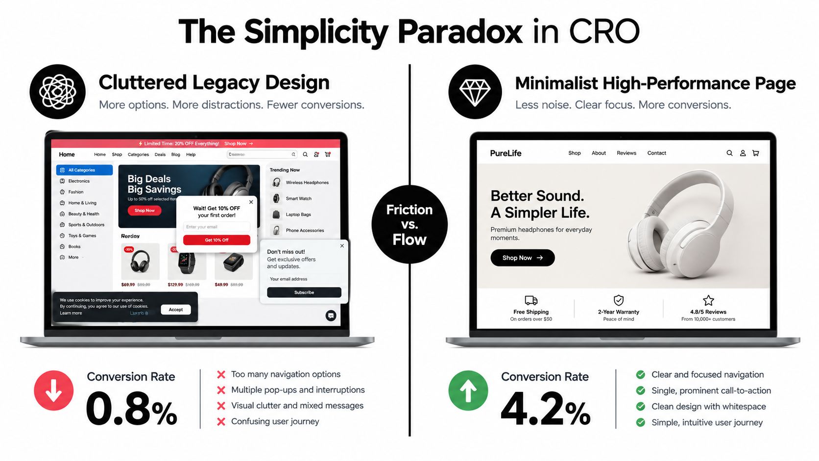
A landing page rarely needs more persuasion. It usually needs fewer competing demands. Navigation, secondary offers, dense copy, decorative modules, multiple forms, and irrelevant proof divide attention, especially on mobile. The first practical move is to remove uncertainty about what deserves attention.
Industry coverage found a wide gap between simpler and more crowded pages. Pages with 7 or fewer elements averaged 9.4% conversion, while pages with more than 35 elements averaged 2.8%, according to Amra & Elma's CRO statistics summary. Treat those figures as a prompt for an audit, not as a target. The useful question is whether each component helps a visitor understand, trust, or complete the intended action.
Audit friction before adding persuasion
Begin with the information required before the primary action:
- What is this offer?
- Who is it for?
- Why should I trust it?
- What happens after I click?
Then inventory every visible component and assign one role: explain, reassure, demonstrate, qualify, or convert. Use a sample SaaS landing page as a working test. The before inventory might include a full navigation bar, a generic headline, two feature grids, three customer logos, a testimonial carousel, a pricing teaser, a newsletter form, and two competing CTAs. The after version can retain a focused headline, one product demonstration, relevant proof, a concise qualification note, one primary CTA, and a short explanation of the next step.
That exercise exposes duplication. A feature grid may explain the product while a long paragraph repeats it. A logo strip may reassure, while a generic testimonial adds little evidence for the visitor's use case. Remove components with no distinct job, then check whether the remaining sequence answers the four questions without forcing visitors to search.
Reduce cognitive and form friction
Forms should request only information needed for the immediate action. Move optional qualification later when possible. Make errors visible, preserve entered data, support autofill, and explain why a sensitive field is required. Small interface decisions often determine whether intent survives completion.
Speed belongs in the same audit. Slow delivery can prevent visitors from experiencing a strong offer, even when the page structure and message are sound. Review image weight, scripts, fonts, layout shifts, and above-the-fold rendering on the devices that generate conversions. Fix the largest blocking resource before debating minor visual details.
The landing-page optimization framework provides a useful structure for turning simplification into a business test. Compare the reduced page with the current experience, measure the primary conversion, and inspect downstream quality. A higher form completion rate paired with fewer qualified conversations is a warning, not a win. Similarly, a lower submission count may be acceptable if the page filters poor-fit demand and produces more revenue per lead.
Deploying Contextual Personalization for Every Visitor
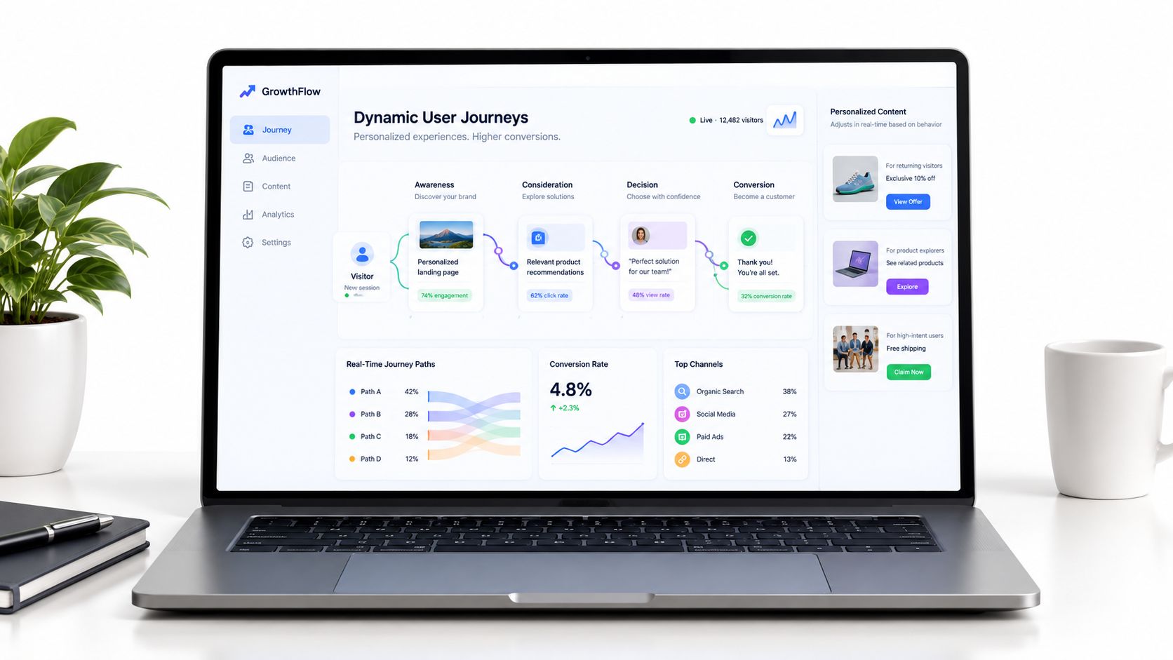
Personalization isn't adding a first name to a headline. It's preserving the visitor's context from the moment they click to the moment they decide. Someone arriving from a product-specific search needs a different opening from someone arriving through a broad awareness campaign, even if both visitors belong to the same account segment.
An effective system changes the sequence of information, not just isolated words. It can adapt the headline, supporting explanation, proof, CTA, and sometimes the order in which those elements appear. The page should feel like a continuation of the visitor's journey rather than a generic destination.
Build a context layer
Feed the system signals that explain why the visitor arrived and what they may need next:
- Acquisition message: Preserve the promise from the ad, social post, email, or search result.
- Campaign and offer: Match the page to the campaign objective instead of sending every audience to the same general page.
- Device: Adjust layout, copy density, form behavior, and CTA placement for the available screen.
- Country: Reflect relevant terminology, regional expectations, and available pathways without making unsupported assumptions.
- Visit history: Treat a first visit differently from a returning visitor who has already seen the core proposition.
- Behavioral intent: Use viewed content, referral context, and prior actions to determine what uncertainty remains.
The important distinction is between useful context and invasive speculation. The system should respond to observable journey signals, not manufacture personal details. It should also preserve brand rules, legal requirements, accessibility standards, and a clear fallback version when confidence is low.
Match the message before expanding the system
The strongest first use case is usually message matching. If a paid ad promises a specific workflow, the landing page should lead with that workflow. If an organic visitor searches for a comparison, the page should address evaluation criteria instead of opening with broad company language. If a returning visitor has already read the feature page, the next experience may need proof, pricing clarity, or a direct next step.
Recent benchmark coverage reported that AI-personalized landing pages outperformed static pages by 87% in a benchmark involving 4,100 page variants across 240 B2B accounts. The same coverage reported personalized landing pages commonly converting at 10% to 20% or more, compared with 2% to 5% for generic pages. These figures come from benchmark coverage of AI and ABM personalization, and they should be treated as directional evidence, not a promise for every implementation.
The operational break-even point depends on traffic, margin, implementation effort, and the value of the conversion event. Personalization makes more sense when the page receives enough qualified traffic to support learning, the audience has meaningful context differences, and the outcome is worth optimizing. It makes less sense when teams create dozens of variants without a measurement plan.
For teams designing how to craft tailored audience experiences, the practical sequence is clear:
- Define the primary conversion and quality guardrails.
- Select a small set of reliable context signals.
- Generate controlled variations for the headline, supporting copy, and CTA.
- Keep a stable fallback experience.
- Compare variants by segment without changing the success metric midstream.
- Promote only versions that improve the business outcome, not merely the click rate.
A real-time personalization approach works when relevance and measurement advance together. Without controlled evaluation, AI can produce more copy, not more insight.
Crafting High-Impact Calls to Action
“Submit,” “Learn more,” and “Get started” are not always wrong. They're incomplete when the visitor needs a clearer reason to act. A CTA should finish the sentence created by the headline and offer a visible benefit for taking the next step.
The best CTA is specific to the visitor's immediate intent. A visitor comparing implementation options may respond to “See the implementation plan.” Someone evaluating a product may need “Watch the product walkthrough.” A high-intent buyer may be ready for “Request a pricing review.” The wording reduces uncertainty because it describes what happens next.
Write for instant comprehension
A 2024 landing-page analysis found that pages written at a 5th-to-7th-grade reading level converted at 11.1%, more than double the performance of professional-level copy. The same analysis reported that personalized calls to action converted 202% better than generic ones. See the landing-page performance analysis from Colorlib for the underlying figures.
Those results support clarity, not childish writing. Remove jargon where it slows comprehension, use familiar verbs, and state the outcome plainly. “Start my free trial” communicates ownership and action more directly than “Register,” while “Get the pricing breakdown” sets a more concrete expectation than “Learn more.”
A useful rewrite process looks like this:
- Name the action: Use a verb that tells the visitor what they'll do.
- Name the value: Explain what they'll receive, see, or accomplish.
- Reflect the context: Tie the CTA to the campaign, search intent, or page section.
- Reduce perceived risk: Add nearby microcopy that clarifies time, cost, or commitment.
- Keep one primary direction: Secondary actions should not compete visually with the main conversion.
Practical rule: If a visitor can't predict what happens after the click, the CTA is asking for trust before it has earned it.
Personalization should remain restrained. Changing “Get started” to include a visitor's industry may add relevance, but it won't fix a vague offer. The most valuable variation usually reflects a real difference in intent, such as changing a demo CTA for an evaluation-stage visitor into a technical documentation path for someone seeking implementation detail.
CTA design also needs to follow the page's simplicity. A prominent button surrounded by competing links still creates indecision. A clear button with a concise explanation, visible contrast, and enough space to tap gives the visitor a straightforward next move.
Measure the CTA against the primary conversion, not clicks alone. A more compelling label can increase clicks while sending poorly qualified visitors into the funnel. The winning version is the one that improves the next meaningful business outcome.
Running Rigorous Experiments Without False Positives
AI can generate variants faster than a human team, which makes experimental discipline more important, not less. A system that produces hundreds of plausible headlines can also produce hundreds of opportunities to mistake randomness for progress.
False positives come from several sources. A test may benefit from a novelty effect, suffer from broken randomization, or appear successful because the team checked enough segments until one produced a favorable result. A result that looks impressive in a dashboard can disappear when the same experience reaches a different cohort.
Set the rules before the test
Write the hypothesis, primary conversion, audience, allocation, duration, and decision rule before launching. Choose one primary metric. Supporting metrics can explain behavior, but they shouldn't replace the agreed success measure because an early click improvement looks attractive.
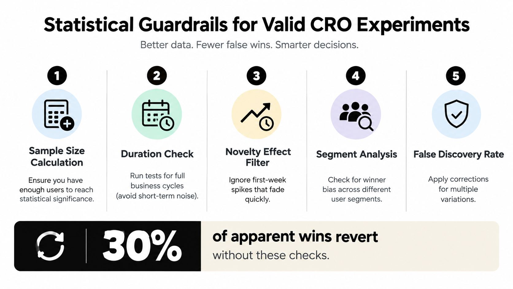
Run the experiment for at least one full business cycle. That gives the test a chance to encounter the normal variation in weekday behavior, sales response, purchasing patterns, and returning visits. Stopping as soon as a threshold appears creates a strong temptation to accept a temporary spike as a durable result.
Check assignment balance before interpreting performance. A nominally even split can still be compromised by duplicate users, caching, targeting rules, bot activity, or implementation errors. If the audience entering each variant differs materially, the comparison may not be valid.
Treat segments as hypotheses
Segment analysis is valuable when it reflects a reasoned hypothesis. For example, a mobile layout test may reasonably require a mobile-specific follow-up analysis. But slicing by device, country, referrer, browser, campaign, and visit history until one group becomes significant inflates the chance of a false discovery.
Technical CRO guidance recommends running tests through a full business cycle and warns that repeatedly slicing results by device or referrer can raise the false-positive rate. It also highlights false positives, novelty effects, and broken randomization as common explanations for apparent wins. The experiment statistics guidance from MetricGate provides the relevant guardrails.
Use a disciplined operating checklist:
- Pre-register segments: State which audience differences matter before looking at outcomes.
- Protect the sample: Don't interrupt the test because a dashboard looks exciting.
- Check implementation: Confirm that assignment, exposure, and conversion tracking work as intended.
- Review quality: Compare lead quality, revenue progression, or activation instead of optimizing a shallow event.
- Replicate important wins: Re-run high-impact changes or validate them in a new cohort before making them permanent.
The goal isn't to eliminate uncertainty. No experiment can do that. The goal is to make uncertainty visible, limit self-deception, and ensure that an AI-generated improvement survives contact with ordinary traffic.
A test backlog should contain fewer, stronger hypotheses rather than a stream of cosmetic edits. Prioritize changes that connect a clear audience problem to a meaningful business outcome. If traffic is limited, prefer focused changes to the value proposition, friction, or message match over complex experiments that divide the audience into too many cells.
Building a Continuous Optimization Engine
Conversion optimization becomes durable when the team stops treating each test as an isolated campaign. The page, the audience context, the experiment history, and the business outcome should form one operating system.
Start with a clean measurement layer. Detect the primary conversion reliably, connect it to the relevant acquisition context, and preserve the version shown to each visitor. Add quality signals where the first conversion is only an early step, such as qualified pipeline, activation, completed onboarding, or paid progression. The right metric depends on the business, but it must reflect value rather than activity.
Create a controlled learning loop
An autonomous optimization engine can follow a repeatable cycle:
- Observe: Collect page, campaign, device, country, visit-history, and conversion signals.
- Diagnose: Identify where a meaningful segment hesitates or underperforms.
- Generate: Produce constrained headline, subheading, and CTA alternatives.
- Test: Expose variants under pre-set rules and guardrails.
- Evaluate: Judge the primary conversion and downstream quality.
- Learn: Store the result so future variants reflect what the audience has already taught the system.
This loop compounds only when the organization records failures as carefully as wins. A losing variation can reveal that the audience prefers a different promise, needs more proof, or wasn't ready for the requested action. Without that history, the team will repeatedly test the same weak ideas under slightly different wording.
The advantage isn't producing more variants. It's learning which context deserves a different experience.
Keep humans responsible for positioning, exclusions, brand safety, and commercial priorities. Let automation handle repetitive production, allocation, and reporting, but don't allow it to optimize blindly for clicks. A page that wins on engagement while lowering qualified revenue is not a CRO success.
The resulting system is less like an endless sequence of button tests and more like a managed feedback loop. Simplification removes unnecessary friction. Contextual personalization makes the remaining message more relevant. Rigorous experimentation decides which changes deserve to stay. Together, those practices give growth teams a more credible way to boost conversion rate without mistaking activity for progress.
Polish offers an autonomous AI agent that reads a landing page, creates headline, subheading, and CTA variations, and selects experiences based on visitor context such as the referring ad, campaign, device, country, and visit history. To apply that approach to your own funnel, visit Polish and evaluate where contextual personalization and simpler pages could improve your next conversion experiment.
- boost conversion rate
- conversion rate optimization
- AI personalization
- landing page CRO
- growth marketing
Your website rewrites itself until it converts.
Polish writes new versions of your headlines and CTAs, tests them on your real visitors and keeps the ones that win.
Start free